What Is the Ken Burns Effect: Bring Your Photos to Life
Discover what is the ken burns effect and learn how this classic pan-and-zoom technique brings your static photos to life for modern creators.
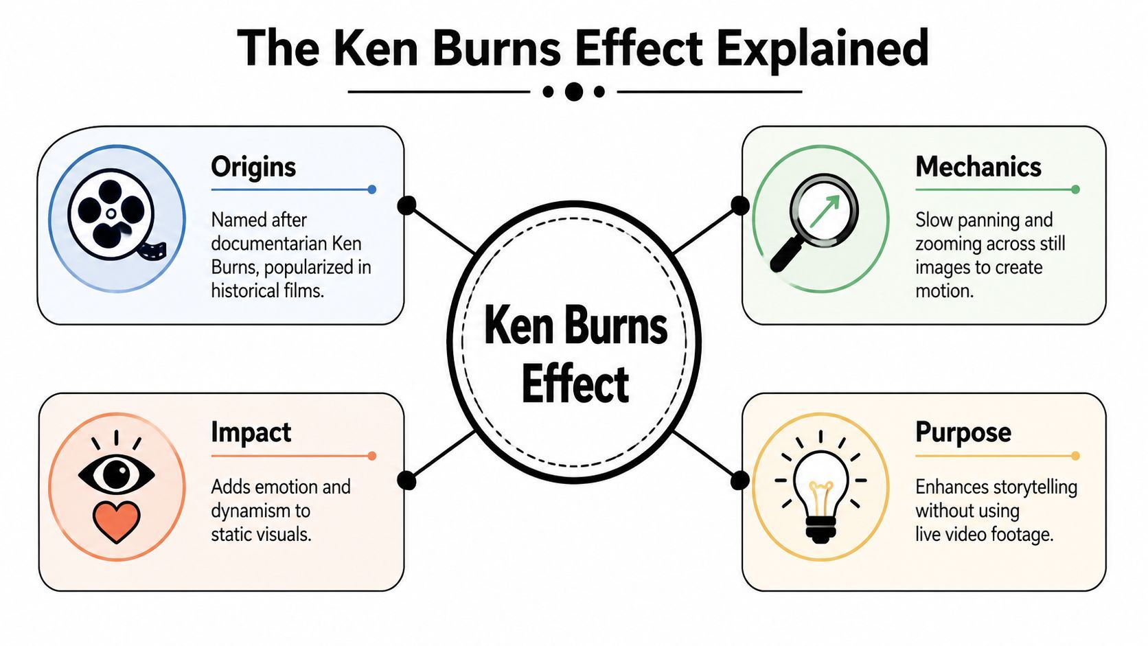
The Ken Burns effect is a video editing technique that creates the illusion of motion by slowly zooming in on, zooming out of, or panning across a static photograph. Editors have used it for over two decades to make still images feel alive and emotionally directed.
If you're staring at a folder of great photos and wondering why your video still feels flat, you're not alone. A simple slideshow often turns strong images into passive background material. The audience sees the pictures, but they don't feel guided through them.
That's where this technique earns its reputation. It gives a still image direction, emphasis, and rhythm without needing live footage. Used well, it can make a family archive feel cinematic, a product shot feel polished, or a historical image feel immediate.
Bringing Your Still Images to Life
A still photo already contains story. The problem is that video asks for movement, timing, and focus. When you drop a sequence of untouched images onto a timeline, the result usually feels like a presentation, not a film.
The answer to what is the Ken Burns effect is simple. It's the practice of animating a photograph so the frame slowly moves across it or gently changes scale over time. That tiny motion changes how people read the image.
Why motion changes everything
A static image asks the viewer to do all the work. They have to decide where to look, how long to look, and what matters. A controlled pan or zoom solves that by acting like a quiet director.
Instead of showing a whole wedding photo at once, you might begin on the couple's hands and slowly widen to reveal the crowd. Instead of holding on a product image, you can move toward a detail that matters, like texture, stitching, or packaging.
Practical rule: If the movement helps the viewer notice something meaningful, it belongs. If it's there just to make the frame look busy, skip it.
Where new creators get confused
Many beginners think the effect is just "adding motion." That's too broad. Its true value is guided attention.
A slow zoom in can create intimacy. A slow zoom out can reveal context. A pan can mimic the feeling of scanning a scene with your own eyes. Once you start thinking in those terms, you stop making slideshows and start shaping moments.
This is why the technique works far beyond documentaries. It fits short-form videos, educational explainers, ecommerce creatives, client presentations, and social clips that need energy without visual chaos.
The Ken Burns Effect Explained
The technique takes its name from filmmaker Ken Burns, who became known for using slow zooms and pans on archival photos to turn still historical material into cinematic storytelling. That style became so recognizable that Apple later built it into Mac software like iMovie and iPhoto as a native feature, a sign of how widely the approach had spread into everyday editing tools, as described in this background on the history of the effect.
Two moves define the effect
The effect relies on only two actions:
- Panning means the frame moves across the image. You might travel left to right across a wide vista, drift downward over a newspaper clipping, or move upward to reveal a person's face.
- Zooming means the frame changes size over time. You either move closer to isolate a detail or pull back to show the larger scene.
That sounds basic because it is. The craft comes from choosing the right start point and end point.
A gallery analogy that makes it click
Think of a large framed photograph hanging in a gallery. If you walk slowly along it, you're panning. If you lean in to inspect a face, a uniform badge, or a handwritten note, you're zooming.
That's the whole principle. The software isn't changing the photograph itself. It's changing the viewer's relationship to it over time.
The effect works because it replaces a static viewing experience with a guided one.
Ken Burns used that idea to turn a single photograph into something that felt like unfolding action. With closeups, sound design, music, and voiceover, one still image could suggest movement, tension, and meaning. That's why the effect became tied so closely to documentary language.
The Narrative Power of Panning and Zooming
A camera move always says something, even when the image is still. If you slowly push into a face, viewers expect emotion or significance. If you drift across a wide image, they expect discovery.
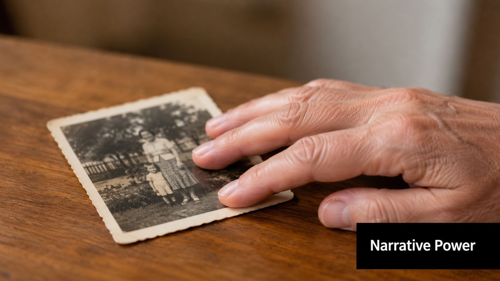
What different moves communicate
A zoom in tends to narrow attention. It can make a portrait feel intimate, turn a map into a guided explanation, or stress one product detail in an ad.
A zoom out often reveals context. It starts with one clue, then shows the wider scene around it. That's useful when you want a viewer to first notice the detail, then understand where it belongs.
A pan creates sequence inside a single image. It can move across a battlefield illustration, a storefront, a classroom photo, or a travel shot in a way that feels like visual narration.
Real creator use cases
- For ecommerce brands: a slow move toward the stitching on a jacket or the texture of a skincare product helps the audience notice quality.
- For travel creators: a pan across a mountain view or old city street gives a still frame a sense of scale.
- For educators and historians: movement across a document, diagram, or archive image can lead the eye in the order you want people to read it.
The key is intent. You're not decorating the image. You're deciding what the audience sees first, second, and last.
How to Create the Ken Burns Effect
In most editing apps, the effect comes from animating Position and Scale. You set a start frame, set an end frame, and let the software move between those points over time. When editors add Ease In and Ease Out, the motion starts and stops more naturally instead of feeling stiff, as outlined in Cloudinary's guide to how keyframed Position and Scale create the Ken Burns effect.
The manual way in traditional editors
If you're using Adobe Premiere Pro, Final Cut Pro, or a similar editor, the workflow usually looks like this:
- Place the photo on the timeline. Make the clip long enough for a slow move to breathe.
- Set your opening frame. Choose where the shot begins. This could be wide or tightly cropped.
- Add keyframes for Position and Scale. These tell the software the exact starting values.
- Move to the end of the clip. Reframe the image and adjust scale to create your destination.
- Apply easing. This softens the move so it doesn't feel robotic.
Some tools also include built-in presets, which is why this effect shows up so often in modern editing workflows.
A faster way to think about it
If you create a lot of short-form content, the bottleneck usually isn't understanding the move. It's repeating the same setup over and over. That's one reason creators keep an eye on broader AI tools for content creation, especially when speed matters as much as style.
A useful shortcut is to think in presets rather than raw keyframes:
- Zoom In when you want emphasis
- Zoom Out when you want reveal
- Pan Left or Right when the image has width
- Pan Up or Down when the subject sits high or low in frame
A simple workflow you can use today
When I teach this effect, I tell beginners to follow one rule. Decide the destination first. Ask, "What should the viewer end up noticing?" Then build your move backward from there.
Use this checklist:
- Choose one subject: a face, object, headline, landmark, or detail
- Start wider than you think: this gives the motion room to develop
- Keep the move slow: the technique loses its elegance when it rushes
- Preview for smoothness: if your eye notices the motion before the story, it's too much
If you want to see the motion in action, this demo helps make the pacing easier to judge:
Best Practices and Common Mistakes
Most problems with this effect aren't technical. They're editorial. The software can make a move. The harder part is making the move feel motivated.
What to do
- Use high-quality images: If you plan to zoom in, start with a photo that can handle cropping without falling apart.
- Move with purpose: Pick a destination that adds meaning. A face, a date, a handwritten note, a product feature.
- Keep it restrained: Slow, deliberate motion feels cinematic. Fast motion feels cheap in most cases.
- Change your approach across a sequence: One image might need a push in. Another might work better with a horizontal drift.
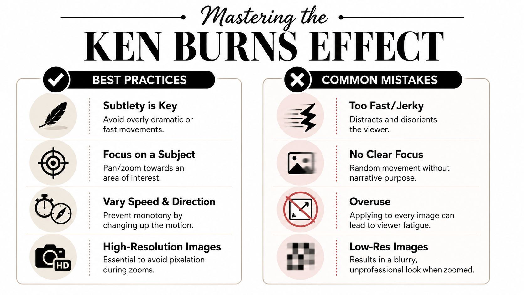
What to avoid
- Don't animate every image the same way: Repeating one move across an entire project gets monotonous fast.
- Don't zoom into nothing: If the endpoint isn't interesting, the audience feels that emptiness.
- Don't move too quickly: The viewer should absorb the image while the frame shifts.
- Don't ignore the cut before and after: The effect should fit the rhythm of the surrounding sequence.
A good move is almost invisible. The audience feels guided, not impressed by the software.
A quick comparison
| Better choice | Weaker choice |
|---|---|
| Slow zoom toward a subject's expression | Fast push that calls attention to itself |
| Pan across a map to explain direction | Random movement with no clear destination |
| Alternate movement styles across scenes | Use the same zoom on every image |
| Start with a clean, detailed source image | Crop deeply into a blurry photo |
If you're still building editing instincts, these Isolate Audio's editing tips are a solid companion resource because they reinforce the larger habits behind clean pacing, shot choice, and viewer-friendly cuts.
The Modern Creator and Historical Context
You are cutting a 20-second short at midnight. You have three archival photos, no usable video, and an audience that will swipe away if the frame feels static for even a moment. That is exactly why this old technique still belongs in modern editing.
The Ken Burns effect solves a very current problem. It gives a still image direction, pace, and emphasis, which matters just as much in a TikTok, Reel, lesson, or ad as it did in long-form documentaries. For a modern creator, it is often the fastest way to turn a flat asset into a shot with intent.
Tools like ShortGenius make that process faster. You can build short-form videos from stills at scale, test different pacing, and produce polished variations without assembling a complicated editing stack. Speed helps, but judgment still matters. A fast tool can produce a thoughtful result or a misleading one, depending on the choices behind the motion.
That is especially true with historical images.
A slow push into a soldier's face can focus the viewer on grief. A crop across a protest photo can shift attention from the crowd to one raised sign. Those edits may be useful, but they are not neutral. Motion changes emphasis, and emphasis shapes meaning. That point gets missed in many tutorials, especially ones aimed at creators who work fast and publish even faster.
A practical ethical standard is simple. Use movement to clarify what is already in the image. Do not use it to imply action, cause, or emotion the photograph cannot support.
A few habits keep you on solid ground:
- Keep the original context intact: Do not crop so tightly that the viewer loses details that change the image's meaning.
- Avoid dramatizing for shock: Fast moves, extreme zooms, and suspenseful framing can make a historical image feel more certain or more cinematic than it really is.
- Label animated material when context matters: In educational, journalistic, or documentary work, a brief note that the photo has been animated can prevent confusion.
- Check the source before editing: A beautiful move on a miscaptioned or misunderstood image still spreads the wrong story.
The best modern creators treat this effect the way a careful documentary editor would. As a guide for attention, not a substitute for truth.
ShortGenius makes this kind of storytelling easier to produce at scale. If you want to turn still images into polished short-form videos, ads, and social content without juggling a pile of separate tools, try ShortGenius (AI Video / AI Ad Generator).