Split Screen Video Editing for Short-Form Creators

Master split screen video editing for TikTok, Reels, and Shorts. Learn layouts, pacing, captions, and platform-native techniques that stop the scroll.
You've built the comparison, recorded both reactions, and added captions. On the timeline, the edit looks energetic. On a phone, though, the faces feel cramped, the text competes with the action, and both panels seem to demand attention at once. That's the point where split screen video editing either becomes a powerful storytelling device or turns into visual noise.
Used well, a split screen lets viewers understand relationships immediately. They can see the product before and after, the tutorial action and the result, or the speaker and the reaction without waiting through separate cuts. Used carelessly, it shrinks every important detail and makes the audience work harder than the story deserves.
Why Split Screen Wins on Short-Form Platforms
A creator posts a reaction video that performs flatly. The setup is clear, but viewers have to watch the original clip first and wait for the reaction afterward. The emotional connection arrives late. A split screen can solve that problem by showing the trigger and response at the same moment, provided both panels remain readable.
That's why the format works especially well for comparisons, reactions, tutorials, reveals, and demonstrations. It compresses related information into one visual field instead of forcing the viewer to remember the first shot while watching the second. The layout becomes part of the explanation, not a decorative effect added after the edit is finished.

A cinematic technique with a practical modern job
Split screen editing isn't a recent social media invention. Divided-frame experimentation traces back to the 1890s, and Edwin S. Porter's Life of an American Fireman from 1903 is widely cited as an early narrative milestone for presenting parallel perception and action. Abel Gance pushed the idea further with Napoleon in 1927, using “Polyvision” to project three images side by side. (PremiumBeat's history of split-screen editing)
The technique became more prominent in the late 1960s and early 1970s, appearing in films and documentaries such as The Thomas Crown Affair, The Boston Strangler, and Woodstock. At the 1964 New York World's Fair, IBM's “Think” Pavilion reportedly used a 17-screen installation that drew more than 10 million visitors, an example of the public appeal of multi-screen presentation before digital editing made the workflow accessible. (Filmora's overview of split-screen video)
When a single frame is the better choice
Split screen isn't automatically more engaging. Use a full-screen shot when one face, gesture, product detail, or visual reveal carries the entire moment. A single frame gives the subject more pixels, more emotional space, and fewer competing signals.
Choose split screen when the relationship between panels matters more than the individual shots. If removing one panel would make the viewer lose the comparison, timing, or reaction, the format is probably doing real editorial work. If both panels merely repeat the same information, cut one.
Practical rule: Add a panel only when it changes what the viewer understands, not simply because the frame has room for it.
Planning Your Panel Layout Before You Edit
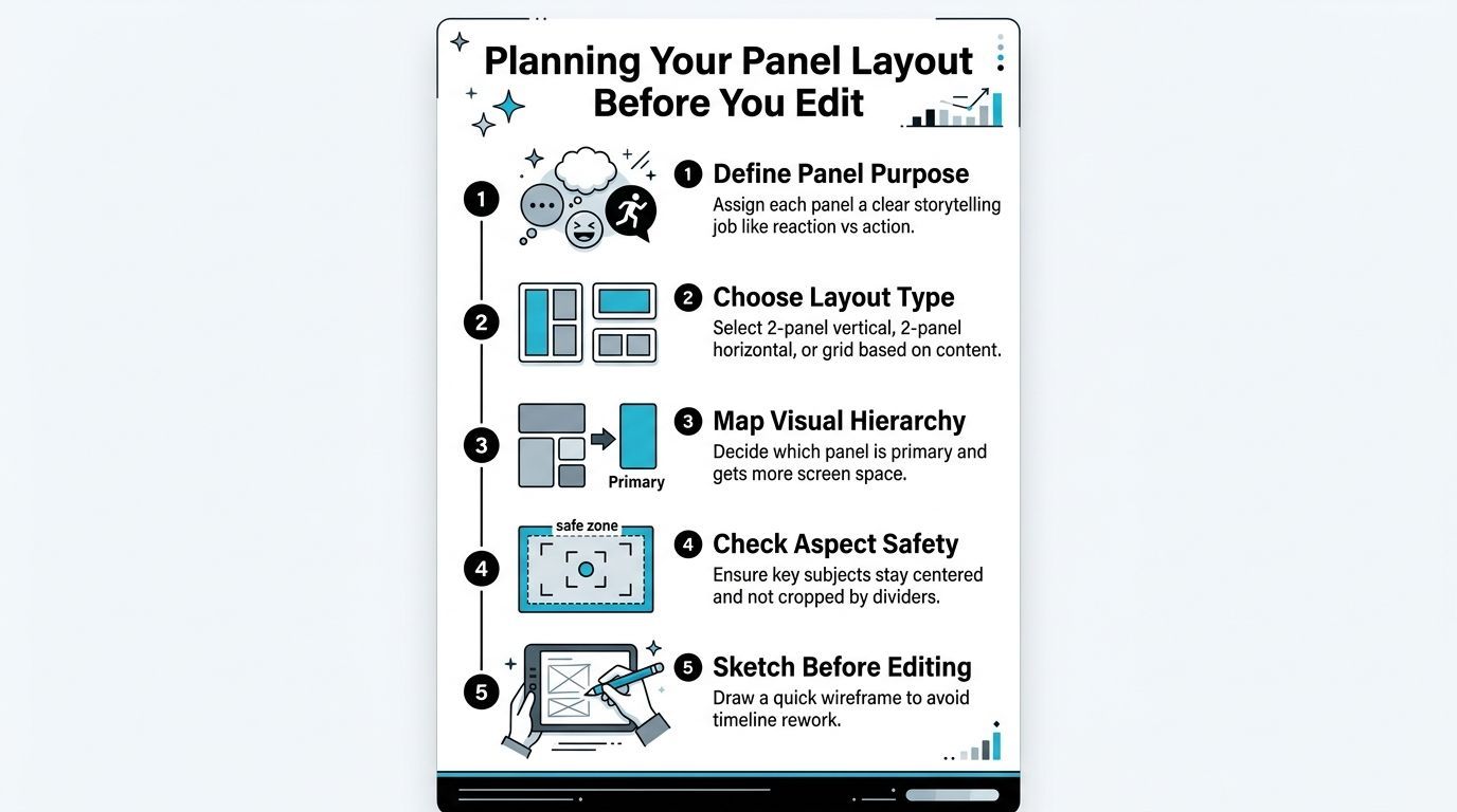
The fastest way to create a messy split screen is to open the editor before deciding what each panel means. Start with a sentence that assigns a job to every frame: “The left panel shows the action, and the right panel shows the result.” If you can't describe a panel's role clearly, the viewer probably won't know why it's there.
Assign jobs before choosing shapes
A two-panel layout is usually the clearest starting point because it supports one direct relationship. Vertical panels work well for two faces, product comparisons, or side-by-side reactions. Horizontal panels can suit demonstrations where the viewer needs more width for hands, tools, or a physical space.
Three panels and grids are useful when the story has multiple viewpoints, but they create an attention problem. Make one panel dominant through size, placement, movement, or contrast, then let the remaining panels support it. Equal visual weight across several active frames often makes the audience scan instead of follow.
Design for the crop, not the source footage
Don't place a wide-screen clip into a narrow panel and hope the original composition survives. Crop around the subject first. Check whether eyes, hands, logos, product edges, and movement remain inside comfortable margins after the divider takes away usable space.
A quick wireframe prevents expensive timeline rework. Draw the intended frame, mark the divider, place rough subject boxes, and reserve an area for captions. The sketch doesn't need to be polished. It needs to reveal whether a face will sit behind text or whether a product will be cut by the panel boundary.
Use this planning check before importing footage:
- Panel purpose: Write the role of every panel in a few words.
- Layout choice: Select vertical, horizontal, or grid based on the action, not habit.
- Visual hierarchy: Decide which frame gets the strongest position or greatest area.
- Aspect safety: Test the crop against the intended phone format and interface overlays.
- Caption space: Reserve room before adding subtitles or labels.
The layout should survive the smallest realistic viewing condition. Review the rough design on an actual phone, not only on a large desktop preview. A composition that looks balanced in the editor can become indecipherable once each panel is reduced.
Editing Techniques That Keep Viewers Watching
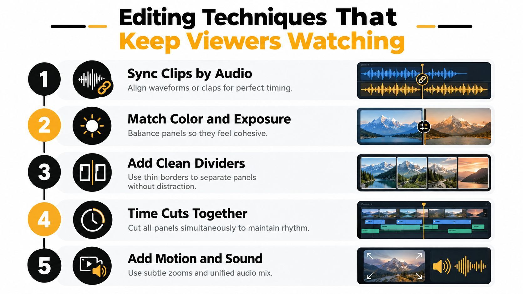
Build the edit in a deliberate order. Start with timing, then fix the image, then control attention with sound and motion. Adding effects before the relationships between clips are clear usually creates more work and less clarity.
Sync the moments that matter
Align clips by a clap, hand movement, spoken word, beat, or audio waveform. If the footage has no shared cue, choose a visual event that gives both panels a meaningful starting point. A reaction that arrives a fraction too early can feel fake, while a late response weakens the connection the layout was supposed to create.
Once the clips are aligned, trim them around the shared event. Don't force every panel to run for the same duration if one shot has dead space. The audience should encounter the relevant action immediately in each frame.
Match the image before styling it
Color and exposure differences become more obvious when clips sit beside each other. Correct the basic problems first: exposure, white balance, contrast, and skin tone. A highly saturated panel next to a dull one will pull attention for the wrong reason.
Add a divider only when it improves separation. A thin border, a clean gap, or a restrained background can distinguish panels without becoming a third visual event. Thick animated borders and decorative frames often consume valuable space on mobile.
Audio needs an even stricter hierarchy. If both speakers talk at once, decide whether the overlap is intentional. Otherwise, choose one primary voice, lower the supporting source, and use subtitles or a short sound cue to preserve context. Captions should follow the active voice and remain visually associated with the correct panel.
Cut with the layout's logic
Hard cuts on a beat can work when all panels change together. A wipe can work when it follows the direction of the divider or introduces a new relationship between frames. Flashy transitions that move independently across multiple panels tend to erase the very structure the viewer is trying to understand.
Use motion sparingly. A subtle push-in can identify the active panel, while a small shift can reveal a product detail. If every panel zooms, bounces, or changes scale at once, nothing has priority.
For platform-native workflows, tools such as CapCut, Adobe Premiere, DaVinci Resolve, and AI-assisted editors can all handle the core process. The interface changes, but the editorial sequence stays consistent: sync, crop, match, separate, mix, and review. Multi-camera research also emphasizes synchronization, viewpoint consistency, and accurate temporal localization as central technical constraints, rather than treating panel arrangement as a purely visual task. (Research on multiview editing and technique recognition)
Designing Split Screens for Mobile-First Audiences
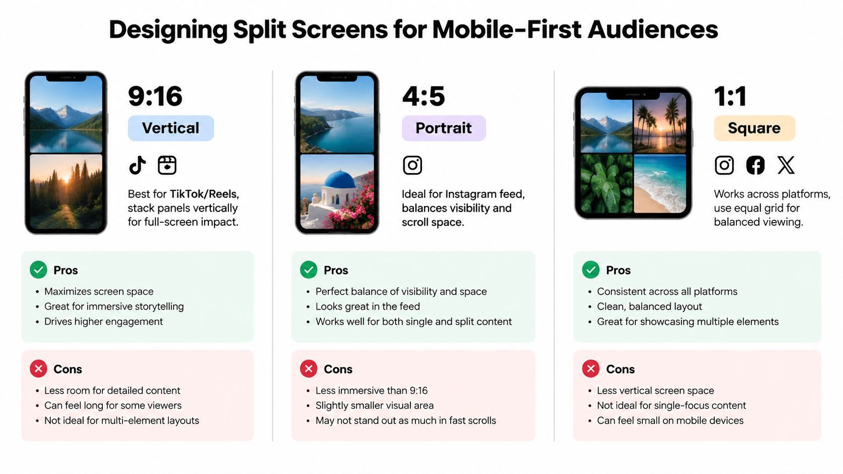
A split screen designed for a desktop preview often fails on a phone because the viewer sees less detail, holds the device at different distances, and encounters platform interface elements around the video. The format must be designed for the destination canvas, not resized into it at the end.
For a 9:16 vertical composition, stacked panels can preserve more usable height for faces and demonstrations. For 4:5 portrait, the frame has a different balance between subject size and feed visibility. A 1:1 square layout can support a balanced grid, but each panel loses space quickly when several clips share the canvas. The correct choice depends on the platform placement and the amount of detail the story requires.
Build a motion hierarchy
The viewer's eye needs a first destination. Give that panel the clearest face, the strongest gesture, the most important product, or the first movement. Keep supporting panels calmer until the story requires them to become active.
A useful pattern is primary action, supporting reaction. Let the demonstration begin in the larger or more visually stable panel, then introduce a reaction with a deliberate glance, expression, or caption. If both panels start with equal motion, equal contrast, and equal text, the viewer has no reliable entry point.
Caption placement follows the same logic. Keep captions close enough to the active speaker or action to establish ownership, but don't let them sit across the divider. When each panel has its own caption region, use consistent alignment and styling so the audience learns the visual grammar quickly.
Treat readability as an accessibility decision
Small text is not a minor aesthetic flaw. It can prevent viewers from understanding the claim, instruction, or product label. Use fewer words per caption, strong contrast, generous line spacing, and enough duration for reading. Avoid placing essential information over a busy panel or inside areas likely to be covered by platform controls.
Simultaneous audio creates another comprehension trade-off. Two voices can represent a real conversation, but they can also overload viewers when both deliver important information. Consider alternating emphasis, reducing the secondary voice, or using captions to make the relationship explicit.
Reduced motion matters too. Fast independent movement in multiple panels can make the video harder to follow for viewers who prefer less motion or process visual change more slowly. Test the finished edit with sound lowered and on a smaller screen. If the story collapses without the audio explanation, the visual design needs more work.
Platform tools increasingly make drag-and-drop editing and 1080p export accessible, while trend coverage points to growing interest in multi-panel, beat-synced edits reaching millions of views. That combination suggests creators need more than cropping instructions. They need pacing, hierarchy, and thumb-stopping composition designed for the feed. (Coverage of video editing trends and multi-panel edits)
Export separate versions when the crop, caption position, or panel arrangement changes by destination. Reusing one master crop everywhere often sacrifices the subject in at least one placement.
Common Split Screen Mistakes and How to Fix Them
More panels don't automatically create more interest. They create more obligations. Every added frame needs readable subjects, deliberate timing, controlled sound, and a reason to exist.
The frame contains too much information
Cramped faces, clipped hands, tiny product details, and unreadable labels usually mean the source composition wasn't planned for division. The fix isn't always a larger canvas. Remove secondary information, simplify the crop, or return to two panels.
Captions create the same problem when editors add them after the layout is locked. Text can cover eyes, cross the divider, or become too small because the creator refuses to sacrifice footage. Reserve caption space during planning and rewrite the copy instead of shrinking it.
The transitions break the relationship
A transition can make two panels feel like unrelated clips. If one panel wipes left while the other cuts right, the viewer may spend the moment decoding the effect instead of following the story. Match transitions to the split line, use synchronized cuts, or remove the transition entirely.
Auto-generated edits also deserve manual review. Caption timing, voiceover alignment, and panel changes can drift even when the software creates a convincing first pass. Watch the video with sound, then without sound, and check whether the visual timing still communicates the intended sequence.
The audio asks for impossible attention
Two people speaking at full volume, music competing with dialogue, and sound effects attached to every panel produce a crowded mix. Choose the primary voice, duck the secondary source, and use pauses to give the audience room to process.
Run this pre-publish audit:
- Readability: Can you read every essential caption on a phone?
- Ownership: Is it obvious which caption belongs to which panel?
- Priority: Does one frame clearly lead when several frames are active?
- Timing: Do cuts, voiceover, captions, and reactions land together?
- Necessity: Would removing a panel make the story weaker?
If the answer to the last question is no, remove it. Clarity beats density.
Scaling Split Screen Production with AI Tools
Once the layout works, turn it into a repeatable system. Save panel templates for recurring formats, such as reaction plus source, problem plus solution, or demonstration plus result. Keep the divider treatment, caption style, audio hierarchy, and opening motion consistent so viewers recognize the series without seeing a logo first.
AI-assisted tools can reduce repetitive production work, but they shouldn't replace editorial judgment. Use automation to draft scripts, generate scenes, create voiceovers, caption dialogue, resize compositions, and prepare alternate versions. Then inspect every panel for crop safety, timing, pronunciation, and visual consistency.
Platforms such as ShortGenius (AI Video / AI Ad Generator) support scriptwriting, image generation, video assembly, natural voiceovers, trimming, captions, resizing, scene and voice swaps, brand kit application, project organization, and scheduling across major social channels. You can use those capabilities to build a split-screen series from a common format, then adapt the crop and pacing for TikTok, YouTube, Instagram, Facebook, or X through ShortGenius.
A production checklist that survives scale
- Define the relationship: Decide whether the panels show comparison, reaction, instruction, or simultaneous action.
- Choose the destination canvas: Create the mobile layout before editing instead of treating resizing as a final repair.
- Set attention order: Identify the primary panel and control movement, contrast, captions, and sound around it.
- Protect comprehension: Check faces, hands, logos, subtitles, and interface-safe areas on an actual phone.
- Review the automated pass: Correct caption drift, awkward crops, inconsistent voices, and competing audio manually.
- Create versions deliberately: Change panel proportions, caption placement, or timing when the platform demands it.
- Save the system: Store presets, brand elements, audio rules, and layout templates for the next edit.
The best split-screen workflows don't chase maximum visual density. They create a clear relationship quickly, preserve enough detail for mobile viewing, and use motion only when it guides the next glance.
ShortGenius (AI Video / AI Ad Generator) helps you turn split-screen concepts into assembled videos with AI-assisted scripts, scenes, voiceovers, captions, resizing, and brand controls. Build a repeatable multi-panel format, adapt it for each platform, and visit ShortGenius (AI Video / AI Ad Generator) to start producing your next series.