Most Realistic AI Images: 8 Examples to Copy in 2026
Explore the most realistic AI images from Midjourney, DALL-E 3, and more. Learn the exact prompts and techniques to create photorealistic AI art yourself.
Beyond blurry faces and obvious hand glitches, AI image realism has crossed a threshold that matters in day-to-day creative work. Human viewers now identify AI-generated images correctly only 62% of the time across more than 287,000 image evaluations by 12,500 participants, according to the global image detection benchmark. In casual viewing, that's close enough to chance that old advice about “spot the weird shadows” doesn't hold up anymore.
That shift changes how I judge the most realistic AI images. I don't care whether an image looks impressive for two seconds in a Discord gallery. I care whether it survives scrutiny in an ad, a landing page, a property listing, or a thumbnail where people assume it's a real photo unless something breaks the illusion.
This guide focuses on that second standard. Instead of treating realism like a vibe, I'm breaking down the prompt architecture, camera language, lighting choices, and model behavior that make synthetic images read as photographic. You'll see what works, what still fails, and how to reproduce the look with intention.
If you're building visuals for products, social campaigns, or even planning concepts like landscape AI design, the same rule applies. Realism comes from disciplined prompting, not from adding “ultra realistic” ten times.
1. Midjourney + Product Photography Prompt + Studio Lighting Style
Midjourney is still one of the fastest ways to create polished product shots that feel commercially usable. Where it performs best is controlled photography: simple backgrounds, predictable lighting, one hero object, and materials with readable surfaces like glass, ceramic, brushed metal, and matte plastic.
A common mistake is prompting for “a beautiful product photo” and stopping there. That gives you decorative imagery, not believable e-commerce photography. Product realism comes from treating the prompt like a shot list.
Prompt framework that actually works
Use a structure like this:
Practical rule: Describe the product first, then the lighting, then the lens, then the backdrop, then the surface behavior.
A reliable Midjourney prompt framework looks like this:
- Subject definition: “premium amber glass skincare bottle with matte black cap, minimal label, clean edges”
- Photography language: “professional product photography, commercial studio shoot, magazine-quality”
- Lighting setup: “soft diffused key light from left, subtle rim lighting, controlled specular highlights”
- Lens and exposure feel: “85mm lens, f/2.8 aperture, shallow depth of field”
- Environment: “white uninterrupted backdrop, soft shadow beneath product, high-end beauty campaign aesthetic”
- Material cues: “realistic glass reflections, brushed metal detail, fine label texture”
That combination gives Midjourney constraints it can render consistently. “Studio lighting” alone is too broad. “Soft diffused key light from left” is usable.
What sells the illusion
Three details make or break these images. First, reflections need to match the material. Ceramic should look soft. Metal should catch sharper highlights. Glass needs transparency and edge definition without turning into chrome.
Second, the background has to stay boring. A lot of fake-looking AI product work fails because the background styling gets more attention than the product itself. For DTC ads, a clean set almost always reads as more authentic.
Third, keep batches close. If a fashion brand is generating seasonal colorways of the same handbag, use one locked prompt skeleton and swap only the product attributes. That's how you get an ad series that feels like one shoot instead of six unrelated generations.
Real-world use is straightforward. A beauty brand can test packaging directions before production. A home goods seller can generate multiple ceramics finishes for paid social. A fashion label can create consistent hero images for launches without rebuilding the whole visual system every time.
2. DALL-E 3 + Lifestyle Portrait Prompt + Cinematic Color Grading
Portrait realism is harder than product realism because people notice tiny mistakes fast. Skin texture, eye direction, teeth, hairline transitions, and clothing folds all get judged instantly. DALL-E 3 can produce convincing lifestyle portraits when you stop asking for “a realistic person” and start directing it like a commercial portrait session.
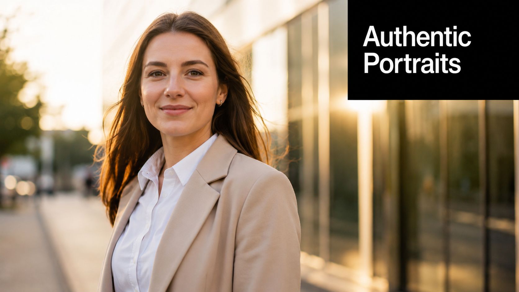
The strongest DALL-E portraits usually sit in a middle zone between headshot and candid. Too polished, and they start reading like synthetic stock. Too casual, and facial details become unstable.
Prompting for believable people
A strong framework looks like this:
- Identity and pose: “professional woman in her 30s, approachable expression, authentic smile, relaxed posture”
- Scene context: “outdoors near a modern office, softly blurred background”
- Photographic treatment: “cinematic portrait, golden hour lighting, shallow depth of field”
- Color language: “warm color grading, Kodak film stock feel, natural skin tones”
- Wardrobe cues: “beige blazer, minimal jewelry, professional but contemporary style”
That last line matters more than people think. Realistic portraits don't just need a face. They need wardrobe logic. Clothing that matches the setting helps the image feel photographed instead of assembled.
What to avoid with human subjects
Don't over-describe beauty. Prompts like “perfect face,” “flawless skin,” and “stunning features” often push the model toward artificial symmetry. Real portrait realism comes from slight asymmetry, believable pores, natural smile tension, and restrained styling.
Also, specify demographics intentionally. If you leave identity vague, outputs often collapse into generic ad aesthetics. A coach building course thumbnails, for example, should define age range, expression, wardrobe, and environment with purpose so the person feels aligned with the offer.
For personal brands, generate several variations and choose the one with the best micro-details around the eyes and mouth. That's where the illusion usually holds or fails. I also look at how hair meets the shoulders. If that transition looks pasted, the image won't survive repeat viewing on a landing page.
Use this style for educator portraits, testimonial art, creator profile imagery, and YouTube thumbnails where you need a face that feels warm but polished.
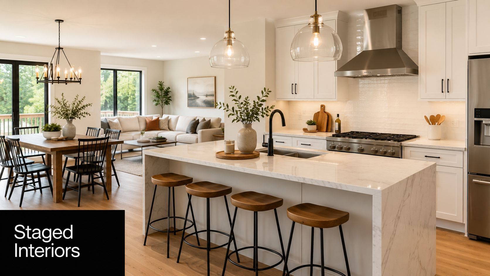
3. Stable Diffusion 3 + Real Estate Interior Prompt + Architectural Photography Style
Interiors are one of the easiest places to get impressive-looking AI and one of the easiest places to get exposed. A room can look beautiful at first glance and completely impossible on a second pass. Chairs float. islands are too wide. window light comes from nowhere.
Stable Diffusion 3 does well here because you can push it toward architectural discipline if your prompt is specific enough. It's a good choice for visualizing spaces before a renovation, staging listing concepts, or generating editorial-style real estate imagery.
The architecture-first prompt pattern
For interiors, prompt in layers:
- Room type: “modern open-concept kitchen and living area”
- Design language: “Scandinavian minimalist, warm wood accents, white cabinetry, marble island”
- Photography style: “professional architectural photography, interior design magazine style”
- Lighting condition: “bright natural daylight from floor-to-ceiling windows”
- Camera behavior: “24mm lens feel, straight verticals, crisp detail, balanced exposure”
That phrase “straight verticals” matters. It nudges the model toward architecture photography instead of dramatic wide-angle distortion. If you want listing-photo realism, ask for restraint.
What makes interiors read as real
The room needs visual hierarchy. Real interior photos don't show every object competing equally. They have a focal plane, a visible light source, and furniture that belongs to the same design story.
Stable Diffusion 3 is especially useful when a real estate agent wants to show different staging directions without physically moving inventory. An interior designer can mock up a coastal-modern version of the same room, then an industrial variation, then a warmer family-oriented version, all while keeping the camera angle similar.
The fastest way to ruin an interior render is adding too many decorative objects. Real rooms have negative space.
Watch the joins. Countertops meeting cabinets, rugs meeting flooring, and chairs meeting table legs are the first places where fake geometry shows up. If those transitions look unstable, rerun the image before doing any upscale work. Polishing a broken composition only makes the mistakes sharper.
4. Claude Vision + Food Photography Prompt + Culinary Magazine Style
Food realism isn't mainly about detail. It's about appetite. The image has to feel physically edible, not digitally embellished. When I use Claude to help build prompts for an image generation workflow, I want it to describe plating, texture, temperature cues, and styling logic with precision.
That's where this setup becomes useful. Claude can help refine the language, especially when you need a prompt that sounds like a food stylist and a commercial photographer collaborated on it.
How to structure a food image brief
A usable prompt skeleton looks like this:
- Dish definition: “pan-seared salmon with crisp skin, lemon butter glaze, roasted asparagus, herbed potatoes”
- Presentation: “restaurant plating, artfully presented, subtle garnish, clean ceramic plate”
- Lighting: “natural window light from side, soft falloff, shallow depth of field”
- Editorial style: “culinary magazine photography, realistic texture, appetizing color balance”
- Freshness cues: “light steam, moist surface highlights, vibrant green herbs, golden brown edges”
Food needs contrast between matte and gloss. A sauce should catch light differently than a potato. A crust should look dry and crisp while the interior still feels moist. If every surface reflects the same way, the dish looks synthetic.
Where most food generations go wrong
They over-style the plate. Too much garnish, too many droplets, too much symmetry. Real restaurant photography is composed, but it still leaves small irregularities. A herb leaf slightly off-center often looks more photographic than a perfectly balanced arrangement.
This is useful for restaurant menu mockups, recipe thumbnails, meal-prep brand creative, and food influencer libraries where the feed needs consistency. A meal service can keep one lighting profile across dishes while swapping ingredients and plating styles. A recipe creator can standardize overhead shots for step-by-step content and switch to side-lit plated hero shots for covers.
If the image needs to feel home-cooked instead of editorial, reduce the polish. Ask for casual plating, a slightly imperfect napkin fold, and softer styling. Realism often increases when the scene stops trying to look expensive.
5. RunwayML + Fashion Model + High Fashion Photography Prompt
Fashion imagery succeeds or fails on pose, fabric behavior, and attitude. You can have a gorgeous face and still end up with an image that feels fake because the sleeve tension is wrong or the garment doesn't respond to gravity.
Runway is useful when the job isn't only generating a single still. It's especially practical when a brand wants to build a visual world around a lookbook, campaign concept, or multi-character scene.
A clean editorial reference helps. So does a narrow style brief.
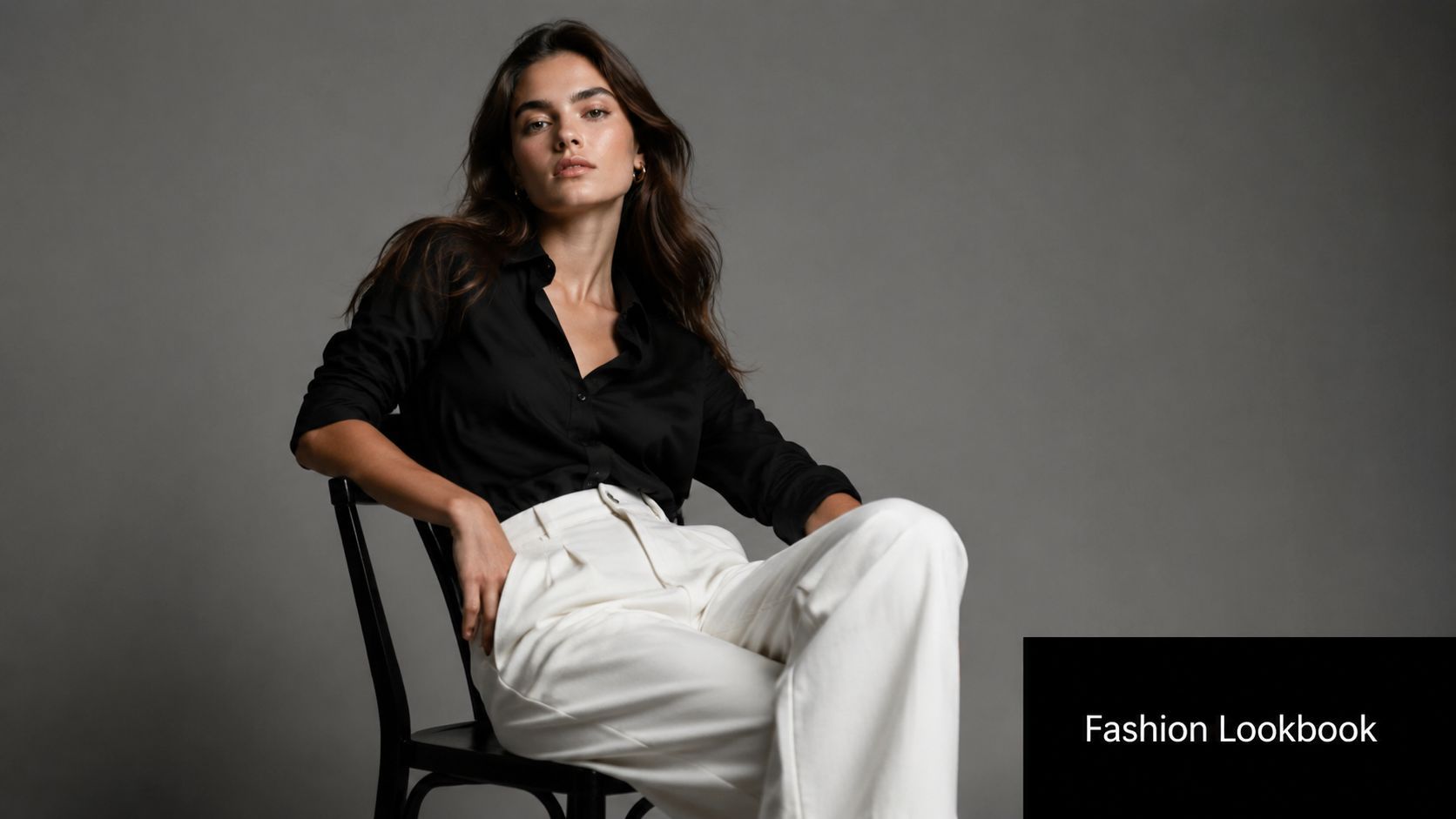
The fashion prompt needs hierarchy
Put the clothing before the person's beauty traits. That keeps the output centered on the garment.
Try a prompt structure like this:
- Garment description: “well-fitted black silk shirt, relaxed white trousers, structured drape, clean seam lines”
- Model direction: “editorial pose, confident stance, natural expression”
- Photography context: “high fashion studio photography, luxury brand campaign, minimalist backdrop”
- Lighting: “softbox key light, subtle shadow contour, polished skin tones”
- Styling control: “modern lookbook aesthetic, restrained accessories, premium fabric realism”
The brand benefit is obvious. A startup can test campaign directions before paying for a shoot. An influencer can visualize multiple styling combinations of one hero piece. A DTC fashion label can explore feed aesthetics before finalizing art direction.
Where realism breaks in fashion
Hands still matter. So do hems, cuffs, collars, and where fabric meets the waist. I always zoom into the tension points first because fake fashion usually collapses at construction details.
Runway also works well when you later want motion extensions from the same visual concept. That matters for reels and paid social, where still-to-motion continuity makes the campaign feel more expensive.
For broader market context, AI image generation is no longer a niche workflow. Stable Diffusion-based models alone have produced more than 12.5 billion images, with 86% of creators and 62% of marketers using AI for image assets globally, according to the 2024 AI image generation market overview. That adoption explains why fashion teams now treat AI visuals as pre-production, testing, and sometimes final creative.
Here's the kind of motion language that pairs well with a fashion still once you want to extend it into video:
Disclose AI-generated fashion imagery when viewers could reasonably assume they're looking at a real model shoot. In fashion, trust erodes fast when audiences feel tricked.
6. Synthesia + Avatar with Realistic Facial Animation + Professional Voiceover
Not every realistic visual needs to pass as a candid photograph. Sometimes the goal is a presenter who feels polished, consistent, and watchable enough that the audience focuses on the message instead of the production method. That's where Synthesia fits.
The right use case isn't “fool everyone into thinking this is a human presenter.” The right use case is repeatable communication. Training modules, SaaS explainers, onboarding videos, internal updates, and educational content all benefit from an avatar that stays on-brand every time.
What works best with AI presenters
Write for spoken delivery, not for reading. Short sentences. Clean transitions. No dense clauses. Realism in avatar video depends as much on script rhythm as facial animation.
A strong setup usually includes:
- Presenter style: “professional business presenter, confident demeanor, direct eye contact”
- Environment: “modern office” or “home studio,” depending on brand tone
- Voice choice: friendly for education, authoritative for compliance, calm for product walkthroughs
- On-screen design: captions, lower thirds, and clean background composition to support the illusion
If the content is emotionally neutral and information-heavy, AI presenters perform well. If the content depends on charisma, improvisation, or emotional nuance, realism drops fast.
Trade-offs you should accept upfront
Synthetic presenters still struggle with the subtle messiness that makes people feel fully human. That's fine if the viewer expects structured communication. It's a problem if you're trying to mimic an energetic founder video or a heartfelt customer story.
Use AI avatars where consistency matters more than spontaneity.
A practical example: an e-learning creator can use one presenter across an entire course library without scheduling talent, matching wardrobe, or re-lighting a room. A SaaS team can keep tutorial videos visually consistent across feature launches. A coach can publish regular explainers with less production drag, as long as they clearly label the presenter as AI-generated.
The best results come when you stop chasing perfect human realism and instead design a credible presentation format around the avatar.
7. Adobe Firefly + Photorealistic Background Expansion + Context-Aware Generation
Some of the most realistic AI images aren't fully generated from scratch. They start with a real photograph and use AI to extend the frame, replace the environment, or add context around the subject. Adobe Firefly is strong in exactly that kind of workflow.
Hybrid images often look more convincing than fully synthetic ones because the original subject keeps real camera information, and Firefly only has to solve the edges, background, and environmental continuity.
Why expansion often beats full generation
Start with a strong source photo. If the foreground subject already has believable light, texture, and perspective, Firefly can do the rest more naturally than many text-to-image tools can invent from zero.
Use prompts like:
- Scene extension: “modern office background with soft daylight”
- Environmental replacement: “urban street with realistic storefront reflections”
- Lifestyle context: “sunlit kitchen interior, neutral tones, shallow background detail”
The trick is matching the original photograph's light direction. If your product is lit from camera right and the new background suggests a window on the left, the edit will feel wrong even if viewers can't immediately explain why.
Best practical uses
Firefly is excellent for social teams that need more variation from limited source material. A marketer can take one product-on-white photo and build several believable environments around it. A creator can expand a vertical shot into a wider composition for ad placements. A real estate editor can add more breathing room around a cropped image without reshooting.
The workflow gets stronger when you think like a retoucher. Keep the foreground untouched where possible. Let AI solve peripheral information. Don't ask it to rebuild the hero object unless you have to.
A lot of “most realistic AI images” people admire online are hybrids. That's not cheating. It's good art direction.
8. Pika Labs + AI Video Generation + Realistic Motion Synthesis + Dynamic Camera Movement
A still image can look photorealistic and still fall apart the second it moves. Motion reveals weight, timing, balance, and physical logic. That's why short video generation is a different realism test entirely.
Pika Labs is useful when you need micro-clips that feel cinematic enough for ads, product demos, and motion backgrounds. The strongest outputs start from a strong still or a tightly written scene description.
Motion realism depends on restraint
Keep the action simple. Ask for one camera move and one primary motion behavior.
A practical prompt framework:
- Base scene: “cinematic product demo of a matte black perfume bottle on reflective surface”
- Camera direction: “slow dolly forward” or “gentle pan left”
- Motion behavior: “soft mist drifting behind product” or “liquid swirl settling naturally”
- Lighting: “controlled studio lighting, warm highlights, realistic reflections”
- Tone: “luxury commercial aesthetic”
Short clips work best because consistency is easier to maintain. For ad creative, that's enough. You don't need a full scene. You need three to six seconds of convincing movement that can anchor a hook.
What separates good AI motion from bad AI motion
Physics. If the camera move is smooth but the object interaction is wrong, viewers still clock it as fake. Reflections should respond to motion. Fabric should lag slightly. Liquids shouldn't move like smoke unless you explicitly want surrealism.
A useful benchmark here comes from realism-oriented testing. In a 2026 comparative benchmark, FLUX.1 reached a 94.2% human indistinguishability rate versus 88.7% for Midjourney v6.1 in controlled photorealism trials, according to the FLUX.1 photorealism benchmark summary. I don't cite that to say Pika is “better.” I cite it because motion tools benefit massively when the source imagery already holds up under close inspection.
For e-commerce, Pika is practical for turning still hero shots into looping promos. For agencies, it's good for storyboard fragments and concept validation. For creators, it produces dynamic background plates that feel more alive than static art.
If the motion is too ambitious, quality drops. Keep the shot disciplined and let the realism come from camera language, not spectacle.
8-Tool AI Image Realism Comparison
| Approach | Implementation Complexity 🔄 | Resource Requirements ⚡ | Expected Outcomes ⭐ | Ideal Use Cases 📊 | Key Advantages & Tips 💡 |
|---|---|---|---|---|---|
| Midjourney + Product Photography Prompt + Studio Lighting Style | Moderate, advanced prompt engineering and iterative tuning for consistent lighting | Low physical cost; subscription/GPU or API access; time for prompt refinement | ⭐ Photorealistic product shots with consistent lighting and high-res suitable for ads | E‑commerce DTC product images, ad thumbnails, seasonal variations | Cuts studio costs; specify lens/lighting/materials; batch similar prompts for coherence |
| DALL·E 3 + Lifestyle Portrait Prompt + Cinematic Color Grading | Moderate, multiple generations often needed to refine expression and demographics | Low production cost; API/subscription and selection time | ⭐ Natural-looking portraits with consistent color grading; occasional anatomical artifacts | Influencer/headshot imagery, course thumbnails, testimonial visuals | Enables diverse representation; specify demographics & emotions; generate 5–10 variants |
| Stable Diffusion 3 + Real Estate Interior Prompt + Architectural Photography Style | Moderate, detailed prompts required for perspective and staging; some manual fixes possible | Low–moderate compute; high-quality prompts and occasional post-editing | ⭐ High-quality interior renders with realistic staging; may show perspective or scale issues | Property listings, virtual staging, architectural visualization | Instant staging iterations; specify room type/style/lighting; verify perspective at high resolution |
| Claude Vision + Food Photography Prompt + Culinary Magazine Style | Moderate, needs food‑specific styling and ingredient detail in prompts | Low cost; prompt work and post-editing to correct textures or steam effects | ⭐ Appetizing, magazine-style food images; challenges with liquids, steam, fine textures | Menu photography, recipe content, food marketing and social media | Avoids food waste; use precise plating/color cues; generate 3–5 variations |
| RunwayML + Fashion Model + High Fashion Photography Prompt | High, detailed control over pose, fabric behavior and diversity; ethical considerations | Moderate compute/subscription; iterative prompt and oversight for artifacts and disclosure | ⭐ High-fashion editorial imagery and garment visualization; occasional artifacting in hands/fabrics | Lookbooks, e‑commerce model shots, inclusive campaign assets | Eliminates casting costs; specify fabric/pose/diversity; disclose AI use and check details |
| Synthesia + Avatar with Realistic Facial Animation + Professional Voiceover | Low–Moderate, UI-driven avatar setup and script prep; simpler workflow than live shoots | Subscription platform; scriptwriting time; limited production overhead | ⭐ Consistent presenter videos with good lip-sync; limited complex gestures | E‑learning, corporate training, product explainers, multilingual content | Scales multilingual content; write concise scripts; always disclose synthetic talent |
| Adobe Firefly + Photorealistic Background Expansion + Context-Aware Generation | Low, straightforward generative fill, best with high-quality source images | Adobe subscription; quality source images and basic editing skills | ⭐ Seamless background expansions that preserve lighting; limits with complex landmarks | Expand b-roll, add location variety, extend limited footage for ads | Integrates with Adobe workflows; start with high‑quality sources; match original lighting |
| Pika Labs + AI Video Generation + Realistic Motion Synthesis + Dynamic Camera Movement | High, motion/physics prompts and camera choreography require iteration; best for short clips | Moderate–high compute; multiple generations; focus on short (3–8s) clips for best results | ⭐ Dynamic short videos with realistic motion and camera moves; longer scenes may artifact | Product demos, animated promos, motion backgrounds for social ads | Creates motion without VFX; specify camera moves and motion descriptors; keep clips short (3–8s) |
Key Takeaways From Prompt to Photorealism
Photorealism comes from art direction, not luck. The strongest AI images in this guide worked because each prompt defined the shot like a photographer, stylist, or production designer would. The model mattered, but the bigger factor was how clearly the brief specified lens behavior, lighting setup, surface response, environment logic, and post-processing intent.
That is the playbook.
Across product renders, portraits, interiors, food, fashion, avatars, background extensions, and motion clips, the pattern stays consistent. Images read as believable when the prompt describes photographic cause and effect, not just mood words. A chrome bottle needs controlled specular highlights. A portrait needs a lens choice that matches facial proportions. An interior needs vertical lines, window light direction, and materials that make architectural sense. If those details are missing, the image often looks polished but synthetic.
Prompt structure also changes output quality in a measurable way. In a 2026 case study, uploading a reference photo to Gemini and extracting a descriptive prompt improved realism fidelity by 31%, raising average realism scores from 6.4/10 to 7.9/10 across 1,200 image generation attempts, as described in the AI re-prompting workflow case study. The same case study found that Leonardo AI Blueprints reduced post-production editing time by 40% and made images 28% more likely to be perceived as authentic by viewers, also reported in the AI re-prompting workflow case study.
That matches real production practice. Strong teams rarely start with a blank prompt if a usable visual reference already exists. They pull apart an image that has the framing, texture behavior, lighting pattern, and grade they want, then rebuild those ingredients in prompt form so the result is repeatable.
The trade-off is simple. Higher realism usually requires tighter constraints, fewer decorative prompt fragments, and less tolerance for anatomy errors, warped geometry, inconsistent shadows, or fake material response.
Hybrid workflows also outperform pure text-to-image generation in many commercial jobs. Starting from a real photo, then extending, cleaning, batching, or animating it, gives the model more visual truth to work from. That is why background expansion, reference-based prompting, and still-to-motion pipelines produce stronger client-ready assets than raw prompting alone.
If you are producing ads, tutorials, product pages, or social campaigns, image quality is only half the job. The useful question is whether the visual can survive the full production chain, including scripting, voice, editing, motion, and publishing. If you want a broader sense of where image tools fit inside modern generation workflows, this ultimate DeepAI guide is a useful companion read.
If you want to turn photorealistic images into finished creative faster, ShortGenius (AI Video / AI Ad Generator) is built for that job. It brings scripting, image generation, video assembly, voiceovers, editing, and publishing into one workflow, which makes it practical for creators, marketers, agencies, and DTC teams that need more than standalone visuals. Instead of juggling separate tools for concepts, thumbnails, clips, captions, and scheduling, you can move from prompt to publish inside a single system.