Instagram Video Aspect Ratio Guide for Every Format in 2026

Master the Instagram video aspect ratio for Reels, Stories, and feed posts. Get exact pixel dimensions, safe zones, and export settings that maximize reach.
You've got the footage open, the edit is almost done, and now Instagram asks a deceptively simple question. Do you want this clip as a Reel, a Story, or a feed post, and which Instagram video aspect ratio will hold up after upload?
That's where most of the pain starts. A horizontally oriented export looks clean in Premiere, then it lands in Reels with dead space, a cut-off caption, or a crop that buries the shot's best moment. The file is technically accepted, but it's functionally weaker, because Instagram doesn't reward clips for merely fitting, it rewards clips that use the screen well.
Why Aspect Ratio Is a Distribution Decision
I've seen the same mistake hundreds of times. A creator finishes a strong 16:9 edit, exports it, uploads to Instagram, and only then notices the platform has turned it into a small strip inside a vertical screen. The frame still plays, but it no longer competes for attention the way a full-height clip does.
That's why Instagram video aspect ratio is a distribution decision, not a finishing choice. It controls how much of the phone display your video owns when someone scrolls past, and that changes whether the clip reads as the main subject or just another item in the feed. Instagram's current guidance points to vertical 9:16 for full-screen placements, with Stories and Reels exported at 1080 × 1920 pixels, while feed video sits in a different lane and commonly favors 4:5, 1:1, and 16:9 depending on where it appears (Hootsuite's 2025 to 2026 sizing guidance).
Screen space is attention space
A clip that fills the phone screen is easier to notice, easier to read, and easier to keep watching. A smaller frame leaves more of the interface visible, which pulls attention away from the video itself.
Vertical-first production won because the mobile viewport is the default viewing environment. Creators now design for screen occupancy first, then adapt the same edit for secondary placements later. Even when a wider ratio is supported, the practical question stays the same, does the frame command enough of the screen to survive the scroll.
Practical rule: if the first version of a clip you export is a horizontal export, you are already choosing a distribution path that works against the mobile feed.
That is also why narrow or letterboxed clips feel weak in-feed. The image area gets smaller, the surrounding UI takes over, and the viewer's eye moves on before the edit can settle. For Instagram, aspect ratio is not just a canvas size, it decides whether the video feels like the main event or background noise. If you want a companion reference for vertical framing decisions, the Veo3 AI vertical video guide is a useful cross-check.
Exact Dimensions for Every Instagram Video Format
A clean workflow starts with one delivery target per placement. Export for that target on purpose. Reels and Stories use the same full-screen vertical frame, while feed video sits in a narrower band and behaves differently once it lands in the grid or the feed. Instagram's current guidance places Stories and Reels at 1080 × 1920 pixels with a 9:16 ratio, while feed videos commonly use 4:5 at 1080 × 1350, along with other supported standard ratios like 1:1 and 16:9.
Treat each placement as its own master export, not as a crop of the same file. That matters in the edit bay and in the upload queue. For feed video, the supported range is broader than many creators assume, and the most efficient delivery format is 4:5 at 1080 × 1350 px within Instagram's feed range of 1.9:1 to 4:5. For Reels, broader upload ranges exist, but 9:16 still matches the full-screen player best. If you need a companion reference for vertical framing decisions, the Veo3 AI vertical video guide is useful as a layout-minded supplement, especially if you're building a repeatable vertical workflow.
| Format | Recommended Size | Aspect Ratio | Supported Range |
|---|---|---|---|
| Reels | 1080 × 1920 px | 9:16 | 1.91:1 to 9:16 |
| Stories | 1080 × 1920 px | 9:16 | Full-screen vertical |
| Feed video | 1080 × 1350 px | 4:5 | 1.9:1 to 4:5 |
| Feed video alternative | 1080 × 1080 px | 1:1 | Supported standard ratio |
| Feed video alternative | 1920 × 1080 px | 16:9 | Supported standard ratio |
The table is about speed, not memorization. When a client wants a quick turnaround, or you are batching exports for a launch, knowing the target before you open the render queue saves revisions. It also keeps you from “fixing” a clip into the wrong shape after the edit is already locked.
Use the format, not just the file
A lot of creators ask for one universal export setting. That is the wrong question. The better question is which version of the cut needs to own the screen, and which one only needs to survive the feed.
Feed video gets one treatment, full-screen social gets another, and carousel video behaves more like a post than a broadcast slot. If you are unsure where a clip belongs, start from the frame and work backward from the destination. The export should match the placement, not force the placement to accept a weak crop.
The Screen Occupancy Principle Behind High-Performing Videos
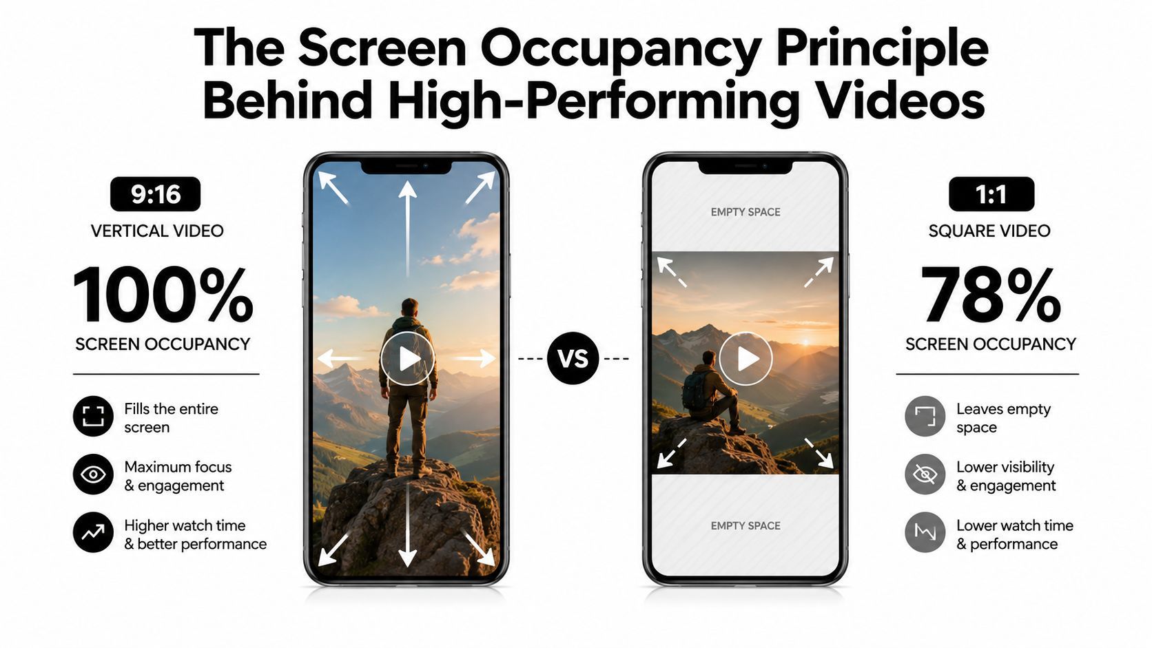
A clip can meet Instagram's technical specs and still lose the frame. A wide export forced into a vertical feed wastes space, and a square post leaves more of the screen to the app than to the actual story. The practical win is not just compliance, it is owning as much of the mobile viewport as the format allows.
That is why 4:5 keeps coming up for feed work. It fills more of the phone than 1:1, and it feels less cramped than a horizontal frame squeezed into a vertical app. Instagram's supported feed range still leaves room for multiple aspect ratios, but the format that uses the screen most efficiently is the one that usually gets the first look.
A separate Instagram Reels dimensions guide also reinforces the same workflow idea for vertical publishing. If you are building for distribution instead of a single export preset, the ratio has to match the placement, not just the source timeline.
Why more occupied screen usually performs better
A frame that fills more of the phone asks less of the viewer. There is less dead margin, less wasted space, and less doubt about where the eye should go first. In a crowded feed, that makes the hook feel immediate instead of partial.
The opposite happens fast. Black bars, pillarboxing, or a horizontal composition shoved into a vertical feed shrink the usable picture, and every lost pixel reduces the room available for the face, product, motion, or text you are trying to make land. That is a practical problem, not a cosmetic one.
The best frame is usually the one that makes the app work harder for you. If the subject is small, the crop is weak, or the motion sits too far from center, the scroll will punish it before the message has a chance.
Feed video is where the ratio decision is clearest
Feed placement exposes the difference between a format that is allowed and a format that is effective. Instagram may support several aspect ratios, but one version still uses the screen better in a busy feed, and that is why 4:5 at 1080 × 1350 is the first export I reach for on feed content that needs to compete for attention.
A talking-head clip, product demo, or visual message with important framing usually benefits more from screen occupancy than from cinematic width. If the cut needs to be read quickly, the frame should serve the scroll. That is the workflow-first choice, and it avoids the common mistake of exporting to a convenient ratio and hoping the platform will do the rest.
For broader format reference, the supported ranges and delivery specs are covered in SocialPilot's specifications, and the practical ratio comparison is also reflected in JoinBrands analysis.
Safe Zones and UI Overlays You Must Design Around
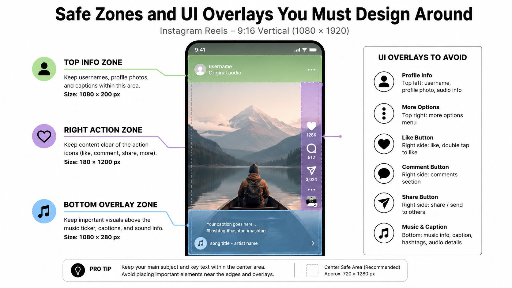
A perfect ratio can still fail if the important part of the frame sits under Instagram's interface. The app covers your video with usernames, captions, icons, progress bars, stickers, and other elements that change how much of the image is readable. The safest habit is to design the central action first and keep text, logos, and faces away from the edges that Instagram likes to occupy.
For vertical placements, think in bands rather than in the whole frame. The top and bottom areas are the most likely to be compromised by UI, and the right edge in Reels is where the icon stack steals attention. In older ad guidance, creators are often told to leave roughly 250 pixels at the top and 340 pixels at the bottom for Story overlays and call-to-action elements, which is a useful practical reminder even when you're not building an ad (Snappa's Instagram ad size guidance).
Where to keep the important stuff
For Reels and Stories, keep the critical subject matter in the middle of the canvas. That means faces, logos, product labels, and CTA text should live in a central zone that won't be crushed by the app chrome. If your lower-third sits too low, the caption field will eat it. If your title sits too high, the profile and progress elements will steal it.
A practical editing habit helps here. Drop guide overlays into your editor, not just a grid. I'll often build a temporary safe-zone layer in the timeline, export a draft to the phone, and check how the clip reads in the app before I approve the final version. That is faster than repairing a published post.
Best practice: design every vertical master so the core message still makes sense if the bottom third becomes partially unreadable.
A simple working method
Use the following checks before you commit a final frame:
- Keep heads off the top edge. Social crops are unforgiving, especially when a person is framed too tightly.
- Park captions above the lower UI band. Don't rely on the app to preserve your lower-third.
- Avoid right-edge callouts. Reels icons can sit directly on top of useful visual information.
- Test with a draft upload. What looks fine in Premiere can break in the native app.
Design discipline pays off. The video can be technically perfect and still lose clarity if the UI owns the wrong part of the screen. Safe zones are not decoration. They're part of the frame.
Common Cropping Pitfalls and How to Avoid Them
The fastest way to waste an edit is to treat every placement like it accepts the same crop. A clip that looks fine in a horizontal timeline can fail the moment it hits Reels, because the app will either box it, crop it, or force the viewer's attention onto the wrong part of the frame. The actual decision is not just whether the file is vertical. It is whether the crop protects the subject, the motion, and the part of the image that sells the shot.
The three mistakes that show up most often
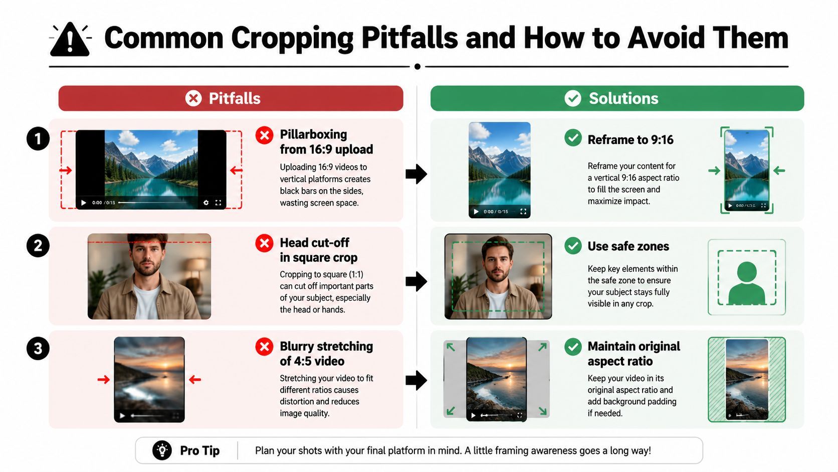
Pillarboxing from a 16:9 upload is the easiest failure to spot. The clip still plays, but the feed gives away screen space on both sides, and the result feels like a repurposed asset instead of a native post. The fix is to reframe into 9:16 or build the piece on a vertical canvas from the start, with the action placed where the eye naturally lands.
Head cut-off in a square crop happens when the subject is centered too tightly and the editor assumes the frame will hold. In practice, the top edge gets eaten by interface elements, thumbnail compression, or a later resize pass that trims a few more pixels than expected. Leave breathing room above the hairline and keep the face high enough that a small crop still reads cleanly.
Blurry stretching of a 4:5 video usually comes from scaling the wrong version of the file or exporting from a flattened timeline. The image may technically fill the space, but fine detail gets soft, text edges lose crispness, and the whole cut starts to look overprocessed. Keep the source aspect ratio intact and resize from the original edit, not from a file that has already been squeezed once.
Vertical can still look cinematic
Some editors try to preserve widescreen shots by dropping them into a black frame and calling it finished. That solves the geometry problem, but it often wastes too much screen occupancy for a feed that rewards tall, immediate visuals. A stronger approach is to rebuild the frame for vertical use, then carry the original image with a blurred background or a styled extension that fills the unused space without distracting from the subject.
I use that approach when the scene depends on atmosphere. A deliberate background treatment reads like part of the design, while a hard black bar usually looks like a compromise. The clip keeps its mood, and the app gets a frame that fills the phone the way Instagram wants it to.
For teams that need to generate several versions from one master, a tool like ShortGenius helps keep the resize workflow moving without rebuilding every cut by hand.
Export Settings and Multi-Format Resize Workflow
Export settings only matter if the file survives upload cleanly. For Instagram, that means keeping the master sharp, avoiding extra recompression before upload, and building the right aspect ratio from the right source timeline. The practical rule is simple, keep quality intact at the edit stage so the platform is not trying to rescue a damaged file.
A template-driven workflow saves far more time than hand-building each version when one project needs multiple placements. A ShortGenius resize workflow can keep editing, resize presets, captions, and brand kit application in one place, then move the same project toward scheduled multi-channel publishing. For teams that need to output vertical Reels, 4:5 feed cuts, and other variants without rebuilding every cut from scratch, preset-based resizing is the part that keeps the pipeline moving.
The export target depends on the placement. Reels and Stories need a 1080 × 1920 vertical master, feed video usually performs better at 1080 × 1350 when the goal is screen occupancy, and the broader feed can still support square or widescreen variants when the content specifically calls for them. The point is to set the timeline and canvas correctly before export, then let the encoder do the least possible damage.
A workflow that doesn't waste time
- Start from the highest-quality source. Don't downscale early if you still need versions for multiple placements.
- Build one master edit. Keep captions, motion graphics, and brand elements on separate layers so they can move cleanly during resize.
- Generate each aspect ratio from the timeline. Resize from the edit, not from a flattened post-export file.
- Check the crop pass manually. Auto-reframe is useful, but it still needs human eyes before publishing.
- Export once per destination. Reusing one file for every platform usually costs quality somewhere.
What to watch during export
The biggest practical problem is usually not the ratio itself. Editors let the framing drift, then the render preset stays pointed at the wrong canvas. If the subject is too close to the edge, the resize pass exposes that mistake immediately. If the file is already compromised before it leaves the timeline, Instagram only makes the problem harder to fix.
I prefer to catch those issues before the export button gets touched. Verify that the master canvas, text placement, and subject framing still hold up after the file is resized for each destination, then confirm the output matches the intended placement before it goes into the upload queue.
A structured workflow beats improvisation. A consistent resize pipeline keeps the same shot usable across placements, and it avoids the cycle of export, inspect, re-edit, and export again.
Your Pre-Publish Checklist for Every Instagram Video
The final check should be boring. If you're guessing at aspect ratio, safe zones, or export dimensions at publish time, the workflow is too loose. The goal is to make the last review feel mechanical, because that's how you catch the stuff that ruins a post after all the creative work is already done.
Reels
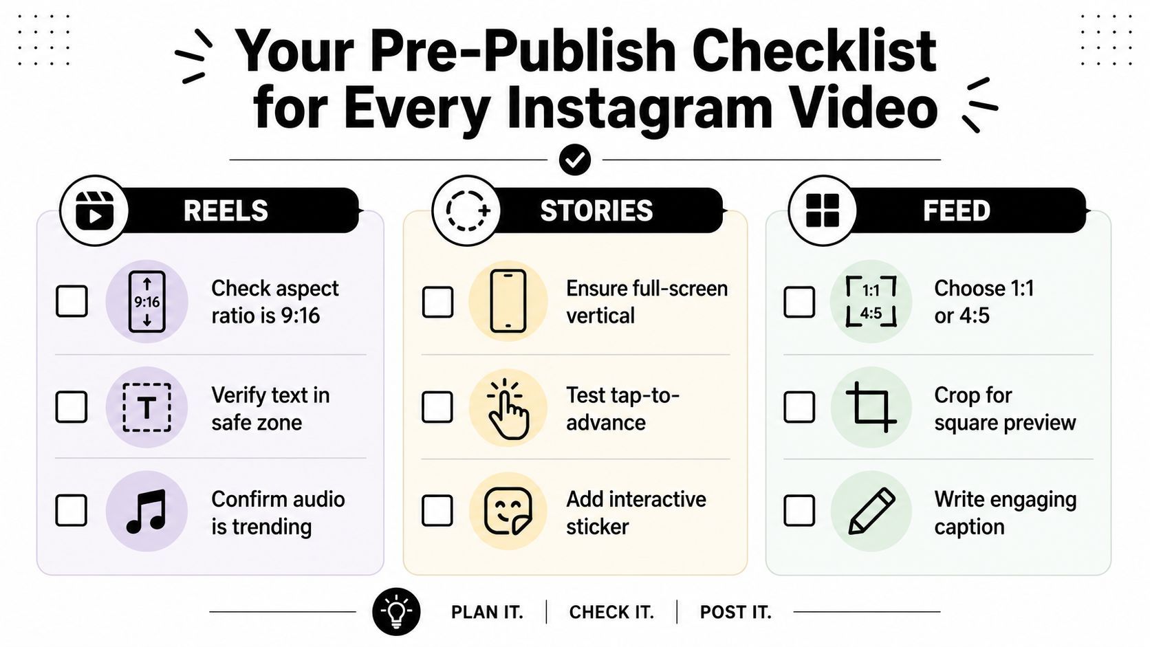
- Check 9:16 framing. Confirm the export is 1080 × 1920 and fills the screen.
- Verify text in the safe zone. Keep titles and CTA copy away from the UI edges.
- Inspect the subject's headroom. Tight crops look fine on a monitor and bad on a phone.
Stories
- Ensure full-screen vertical delivery. Stories should land as a clean 9:16 canvas.
- Test tap-to-advance pacing. If the shot depends on a slow reveal, keep it concise.
- Add interactive elements intentionally. Stickers and buttons should support the message, not cover it.
Feed
- Choose 1:1 or 4:5 on purpose. If you want more screen occupancy, 4:5 is usually the stronger first choice.
- Crop for the thumbnail preview. The feed image has to read before the viewer taps play.
- Write a caption that matches the frame. The visual and the text should feel like one post, not two separate ideas.
A quick decision rule keeps the process simple. If the clip needs maximum screen ownership, use 9:16. If it's a feed video and the hook depends on visible subject matter, use 4:5. If the creative relies on a broader composition, accept that you're choosing presentation over occupancy and frame accordingly.
If you can't explain why the chosen ratio helps the viewer, the ratio probably isn't the right one.
Run that check before every upload, and the whole pipeline gets easier. You'll spend less time repairing crops and more time publishing clips that already fit the app they're built for.
If you want a faster way to produce the right Instagram video aspect ratio from the start, ShortGenius (AI Video / AI Ad Generator) can help you assemble, resize, caption, and schedule vertical and feed-ready versions from one workflow. It's useful when you need clean 9:16 Reels, 4:5 feed exports, and consistent brand formatting without rebuilding every cut by hand.