How to Color Correct Image for Video and Social Media

Learn how to color correct image assets for thumbnails, ads, and short-form video. Master white balance, exposure, skin tones, and cross-device consistency.
You've shot a short-form campaign on an iPhone, a mirrorless camera, and a webcam. The product is the same, the brand colors are the same, but the thumbnail from each device tells a different story. One looks blue, another turns orange, and the webcam frame pushes skin tones toward green. By the time you start adjusting saturation, you're no longer correcting images. You're chasing inconsistencies.
To color correct an image for thumbnails and ad creatives, treat the process as a controlled pipeline. First establish a believable neutral image, then recover usable detail, then refine people and brand colors, and only after that add a creative grade. This order matters because a stylish look can't repair a white balance error, clipped highlights, or a face that changes color from one camera angle to the next.
Diagnosing Color Issues Before Touching Any Slider
Most slow correction sessions begin with the wrong first move. The editor opens the temperature control, drags it until the image feels pleasant, then tries to repair the consequences with contrast and saturation. That approach may work for one photograph, but it breaks down across a batch of thumbnails and ad variations.
Start with three questions:
- What's the dominant cast? Is the entire frame warm, cool, green, or magenta? Look at neutral objects first, not vivid packaging or colored clothing.
- Where is exposure failing? Are bright areas losing texture, or are shadows hiding facial and product detail?
- Is contrast flat or crushed? A flat image lacks separation between tones. A crushed image has shadows or highlights that feel unnaturally blocked.
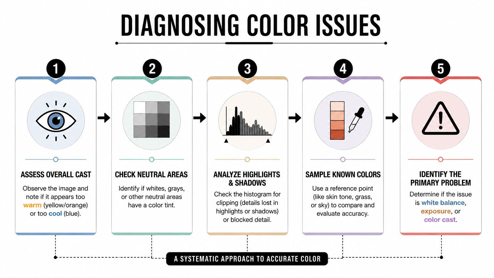
Read neutral areas first
A tungsten-lit product shot often has an obvious orange cast. An overcast outdoor frame may look blue, but a green-magenta shift can hide inside the midtones. A mixed-light interview is harder because daylight from a window can cool one side of a face while a practical lamp warms the other.
Use the histogram to understand tonal distribution, but don't expect it to identify every color problem. The histogram can show whether the image is heavily weighted toward shadows or highlights. It can't tell you whether a white shirt is neutral, so inspect the image and use a vectorscope when your software provides one.
A useful reference is the polished AI portrait color guide, especially when you're comparing subtle portrait changes and want to separate believable correction from an artificial makeover.
Name the primary problem
Choose one dominant issue before editing. If the image is underexposed and green, fix the exposure problem enough to judge the cast, but don't compensate for every flaw at once. Labeling the primary failure keeps you from using saturation to disguise poor contrast or using tint to compensate for an incorrect light source.
Practical rule: If you can't describe the problem in one sentence, you haven't diagnosed it yet.
For camera matching, save a still from each source and compare them side by side under the same display conditions. Cross-camera color consistency remains an active technical problem. Research on adaptive white-balance correction found that illumination-dependent transformations can be safer than a fixed correction when lighting is spatially complex or camera-specific, as described in this peer-reviewed study of non-diagonal white-balance models.
Fixing White Balance and Exposure as Your Foundation
White balance and exposure form the technical base of a usable image. If the neutral point is wrong, skin tones, product colors, and brand accents all inherit the error. If exposure is wrong, later curve adjustments often create a polished-looking image with missing information.
Place the white-balance eyedropper over a surface that should be neutral, such as a gray card, white wall, or unprinted gray area. Avoid specular highlights, colored reflections, and objects that only appear white because your eyes adapted to the lighting. The eyedropper is a starting point, not a verdict.
Temperature and tint need separate decisions
Temperature addresses the warm to cool direction. Tint handles the green to magenta direction. They interact because changing one can make the other cast more visible, particularly in fluorescent interiors, LED lighting, and scenes with colored walls.
Make a small temperature adjustment, pause, and then reassess tint. Don't drag both controls aggressively. If you're correcting an iPhone image, remember that computational processing may already have chosen a pleasing white balance and contrast profile. A mirrorless RAW file gives you more neutral latitude, while a webcam frame may contain baked-in processing that limits recovery.
Use the histogram as a check
After the image looks neutral, check the histogram and the brightest important areas. You're looking for a tonal distribution that preserves the subject, not a perfectly centered graph. A white product can occupy the high end without being clipped, while a dark background can remain low without making the whole image underexposed.
For product-focused campaigns, accurate color also depends on the setting and surrounding visual context. Guidance on lifestyle photography for better conversions can help you think beyond the object itself, particularly when the environment reflects color onto packaging or clothing.
Once the foundation is stable, compare the corrected frame with neighboring shots. A technically neutral image can still be wrong for a sequence if the surrounding images are warmer, darker, or more contrasty. Match the set, not just the individual file.
Recovering Highlights and Shadows Without Losing Detail
Thumbnail work exposes tonal mistakes quickly. A blown product label becomes a blank shape. A face buried in shadow loses its expression when the image is reduced and compressed. The correction challenge isn't making every region bright. It's preserving the detail that carries meaning at small display sizes.
Start with the clipping indicators in your editor. Lower highlights before moving the whites control when bright areas contain recoverable texture. Highlights work on a broader tonal region, while whites define the endpoint of the brightest tones. Use whites afterward to establish a clean upper boundary without flattening the entire image.
Work from broad recovery to endpoint control
A practical order is:
- Highlights: Pull back bright regions that distract from the subject or hide product texture.
- Whites: Set the brightest tonal point after highlight detail is visible.
- Shadows: Open dark regions carefully, especially around eyes, hair, and product edges.
- Blacks: Establish depth after you've decided how much shadow information the image needs.
The order matters because lifting blacks before recovering highlights can make the image look gray and weak. Opening shadows too early can also tempt you to add contrast later, which may recreate the detail loss you were trying to avoid.
Judge at delivery size
Inspect the image at full resolution to identify noise, banding, and texture problems, but judge the final decision at the size people will see. A shadow lift that looks attractive at 100% can turn into muddy chroma noise after social compression. This is especially common in smartphone footage and webcam captures, where dark regions may already contain aggressive noise reduction or sharpening.
Some information isn't recoverable. If the source clipped a bright forehead, white label, or reflective bottle, reducing whites won't recreate the missing texture. Replace the shot, mask the area, or redesign the crop instead of forcing a slider to solve a capture problem.
The useful question isn't “How much detail can I recover?” It's “Which detail still reads after reduction and compression?”
For batch correction, use the same visual reference across the set. A method that looks convincing on one camera may create different noise and contrast behavior on another. Benchmarks of nonlinear color mapping have evaluated both corrected color error and execution time, reinforcing a practical point for production teams: quality and throughput need to be considered together, not separately. The York University color-balance benchmark also describes training on more than 65,000 paired images and reports generalization to camera models not used during training.
Correcting Skin Tones and Color Tint for Human Content
Viewers may not name a skin-tone error, but they usually notice its effect. A face that turns orange can feel overheated. A green cast can make someone look ill. A magenta shift can make makeup and clothing appear disconnected from the rest of the frame.
Begin with the vectorscope when available. Use a skin-tone isolation mask or HSL selection to inspect the face without letting a vivid background distract you. The vectorscope gives you a repeatable reference for hue direction, while your eyes judge whether the correction still fits the lighting and complexion in the scene.
Correct hue before saturation
Use HSL controls to target the orange and red ranges, then make the smallest hue adjustment that removes the unwanted cast. Fluorescent lighting commonly produces a green influence, while warm practicals can push faces toward orange. Environmental spill from painted walls, colored signs, or product packaging may affect only one side of the face, so a global correction can make the unaffected skin worse.
Saturation usually deserves restraint. Increasing it may make a face look lively for a moment, but it often exaggerates redness, makeup, and compression artifacts. A modest reduction can restore believable skin, especially after a camera has already applied strong processing.
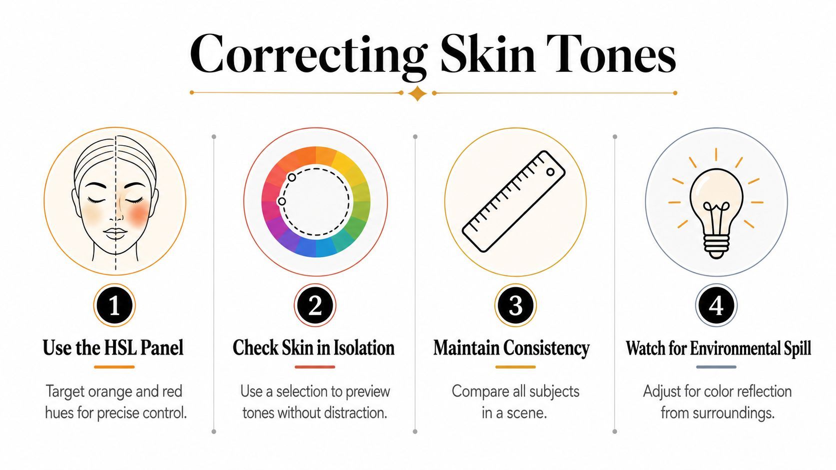
Check the subject against the scene
Technically acceptable skin can still look wrong against a blue background or a saturated brand color. Compare all subjects in the same scene, then review the face in the full composition. Don't force every person toward an identical appearance. Preserve natural variation while removing the camera or lighting cast.
For a thumbnail, prioritize the face, eyes, and the object the person is holding. Those areas carry the message at a glance. If the background is competing with the subject, reduce its saturation or luminance selectively instead of overcorrecting the skin.
The video below offers a visual reference for portrait color decisions and helps illustrate how small tonal changes affect perceived realism.
Finish by toggling the correction on and off. If the change is obvious but the viewer can't identify what changed, you're probably close. If the face becomes the first thing you notice because it looks unusually vivid, reduce the adjustment.
Applying Selective Color Adjustments and Curves for Brand Consistency
Neutral correction gets the image into the right neighborhood. Brand consistency requires more deliberate control. A red package that shifts toward orange across cameras can weaken a campaign even when the overall exposure and white balance look acceptable.
Use selective controls for the colors that matter commercially. Isolate the product hue, brand accent, or background color, then adjust hue, saturation, and luminance independently. This is safer than raising global saturation, which also intensifies skin, reflections, and unwanted background colors.
Target the important color, not the whole image
A product color may need a subtle hue shift while its luminance stays stable. If you change all three HSL properties together, you can accidentally make the object brighter, darker, or more artificial than the brand reference. Compare the corrected asset with a trusted packaging image, approved thumbnail, or brand palette displayed in the same color-managed environment.
Masks make the correction more precise. A luminance mask can protect highlights on glossy packaging while a color mask isolates the body of the product. Feather the selection so the edge doesn't produce a visible halo, particularly around hair, glass, and reflective surfaces.
Use curves for controlled separation
A gentle curve can create depth without turning every thumbnail into a high-contrast poster. Add separation around the subject's midtones, keep important facial detail intact, and check dark areas for blocked texture. Heavy-handed S-curves often make compression artifacts more visible and can remove the soft transitions that make a portrait feel natural.
Correction becomes grading. Correction answers whether the image is coherent and believable. Grading answers whether the image feels like the brand.
Brand consistency comes from repeatable decisions, not identical slider values.
Save presets only for adjustments that remain stable across the source material. A camera-matching preset may transfer well across a controlled setup, but it can fail when lighting, lens, or background changes. Build a reusable base look, then keep selective corrections adjustable for each shot.
Cross-camera work benefits from adaptive methods rather than assumptions that every sensor responds alike. Recent research on calibrated color correction matrices addresses consistency across sensors, which is directly relevant to ecommerce libraries, UGC, and agency pipelines using mixed devices. The ICCV 2025 cross-camera color constancy paper provides useful technical context for why one universal look can fail across cameras.
Choosing the Right Tool for Your Workflow
The right editor depends less on prestige than on where correction happens in your pipeline. Lightroom is efficient for still thumbnails and batch presets. Photoshop is stronger when you need masks, compositing, cleanup, or precise product-color work. Capture One can be valuable for photographers who need strong RAW handling and camera profiles, while mobile editors are useful when the entire campaign starts and ends on a phone.
| Tool | Batch Speed | Cross-Camera Consistency | Mobile Sync | Best For |
|---|---|---|---|---|
| Lightroom | High for still batches and presets | Strong when profiles and reference images are controlled | Strong in Adobe workflows | Creators managing repeated thumbnail sets |
| Photoshop | Slower for large batches | Strong for detailed manual matching | Limited compared with Lightroom | Product retouching, masks, and layered composites |
| Capture One | Strong for organized RAW workflows | Strong when camera-specific profiles are available | Depends on the surrounding workflow | Photography-led teams and tethered capture |
| Mobile editors | Fast for quick individual edits | Variable across devices and app processing | Native on mobile | On-location corrections and rapid publishing |
Match the tool to the bottleneck
A solo creator often benefits from one batch-oriented editor with presets, a consistent export setup, and a small reference library. A team managing several brand accounts needs shared profiles, naming conventions, approval steps, and a clear distinction between technical correction and creative grading.
AI auto-correction can save time when the source material is reasonably consistent and the output only needs a first pass. It becomes a liability when the image contains mixed lighting, unusual skin tones, colored reflections, or a product whose hue must remain faithful. Review the result rather than accepting the algorithm's confidence.
For teams creating ads as well as images, ShortGenius (AI Video / AI Ad Generator) combines scriptwriting, image generation, video assembly, voiceovers, editing tools, resizing, and brand-kit application in one workflow. Its image-editing models can also support prompt-guided transformations, but final color approval should still happen against your brand reference and on more than one device.
The scalable setup is usually hybrid: automate the repeatable base correction, then reserve human attention for skin, product color, mixed light, and campaign-level consistency.
Avoiding Common Mistakes and Exporting for Maximum Quality
A correction can look perfect in your editing application and still fail after upload. The most common culprit isn't a missing cinematic preset. It's a mismatch between the color space used during editing and the assumptions made during web delivery.
The modern web's default RGB workflow was formalized through sRGB. HP and Microsoft proposed it in 1996, the W3C published the proposal on 5 November 1996, and IEC later formalized it as IEC 61966-2-1:1999, published on 18 October 1999. The W3C sRGB documentation explains why this baseline made color delivery more predictable across monitors, printers, and web workflows.
Keep the export practical
For social thumbnails, covers, and ad creatives, export an RGB file tagged as sRGB unless the destination explicitly requires another workflow. Adobe RGB can hold a broader range for some print applications, but it isn't the safest default for ordinary web delivery. Don't assume a wider color space will look better after a platform converts or interprets it.
Avoid sharpening as a reflex. Excessive sharpening creates bright halos around text, hair, and product edges. Those halos become more distracting after resizing and compression, especially around high-contrast thumbnail subjects.
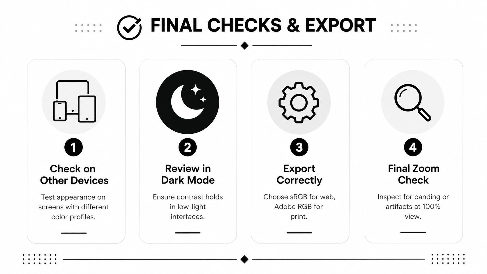
A final review should include:
- Device check: Open the export on a phone and a desktop display, then compare it with the source.
- Dark-mode check: Review the image against dark interface backgrounds so shadows and outlines remain readable.
- Color-space check: Confirm the file uses sRGB for web delivery and that the profile is embedded when your application supports it.
- Detail check: Inspect at 100% for banding, halos, posterization, and compression artifacts.
- Sequence check: Place the asset beside other campaign creatives to catch camera or preset drift.
Color correction should also be measurable where production volume makes subjective review expensive. A recent review notes that color image quality assessment still lacks standardized datasets and evaluation metrics, while newer correction systems increasingly balance accuracy with fast inference. The 2025 review of color image quality assessment is a useful reminder that “looks better” isn't a sufficient quality-control standard for an automated pipeline.
Your final checklist should catch three failures before publishing: the wrong color space, detail destroyed by aggressive recovery, and a correction that matches one camera but not the rest of the campaign.
ShortGenius (AI Video / AI Ad Generator) helps you turn corrected images and brand references into short-form videos, ad creatives, thumbnails, captions, and resized campaign assets, with editing and brand-kit tools built into the same workflow. Visit ShortGenius (AI Video / AI Ad Generator) to create, refine, and organize consistent multi-channel content without losing control of the visual finish.