How to Create Brand Guidelines: A Playbook for Your Team
Discover how to create brand guidelines with a practical, step-by-step guide your team can use today.
Your brand guidelines are more than just a document—they’re a playbook. This guide defines your core strategy, locks in your visual identity (logo, color, typography), and sets your brand voice. It’s the single source of truth that ensures everyone who represents your brand does it with purpose and consistency, which is vital for protecting its value.
Why Most Brand Guidelines Fail (and How Yours Can Succeed)

Let's be real for a second. Most brand guides are treated like a one-and-done design task. They get created, saved as a PDF, and then promptly forgotten in a shared drive somewhere. They fail because they’re just a collection of rules, not a strategic tool.
A guide that actually works does more than just demand consistency; it explains the why behind every choice. It’s the difference between saying "Don't use this color" and explaining how your primary color palette evokes a specific emotional response in your target customer. That context turns abstract rules into practical, actionable intelligence.
The Real Business Case for Brand Guidelines
Too many people see brand guidelines as a "nice-to-have" creative project. That's a huge mistake. Think of them as a direct investment in your company’s growth and stability.
Clear, accessible guidelines are the foundation for scaling your marketing without watering down your message. They make sure every single piece of content—from a quick TikTok video to a formal sales deck—feels authentically yours.
This consistency has a real financial upside. Companies with strong, enforced brand guidelines see it in their bottom line. In fact, a whopping 68% of organizations say brand consistency has contributed at least 10% to their revenue growth, with some attributing over 20% growth to it.
A well-crafted guide really delivers on a few key fronts:
- It empowers your team. It gives employees, freelancers, and agencies the confidence to create on-brand materials without needing constant hand-holding.
- It builds customer trust. A consistent experience makes your brand feel professional, reliable, and memorable. It’s a quiet signal of quality.
- It protects your brand value. It stops the random, off-brand messaging that slowly erodes what customers think of you.
- It makes you more efficient. Teams waste less time asking for approvals or fixing mistakes, which means campaigns and content get out the door faster.
Think of your brand guide as your company’s constitution. It isn’t there to restrict creativity. It’s about providing a framework where creativity can thrive in a way that’s focused and effective.
From a Book of Rules to a Box of Tools
The most effective brand guidelines aren’t framed as rigid restrictions. They're presented as helpful resources. The best ones are designed for usability, answering questions before they're even asked and providing templates that make doing the right thing the easy thing.
You can see the real-world impact of strong guidelines in successful branding outcomes, especially when working with partners. When an agency truly understands your brand's DNA from the start, they can run campaigns that hit the mark every time.
Ultimately, your goal is to create a guide that people actually want to use. When your team sees that the guidelines are there to make their jobs easier and their work better, you've moved from simply enforcing rules to inspiring true brand stewardship. Let's dive into how you can build that kind of indispensable resource.
Setting Your Brand’s Strategic Foundation
Before you even dream of picking a font or a color palette, we have to talk about your brand's soul. Seriously. This is the part everyone wants to skip, but it’s the absolute first step in building brand guidelines that actually mean something.
Without this strategic backbone, your brand guide is just a pretty document full of rules. With it, it becomes the playbook for expressing your brand's core purpose.
Mission, Vision, and Values
Everything starts with three core pillars: your mission, your vision, and your values. Think of these as the "why" behind every single design or content decision you'll make down the line. They’re the anchor that keeps your brand feeling intentional and cohesive.
Your mission statement is what you do right now. It's a clear, concise statement about who you serve, what you provide, and the impact you’re making today.
Your vision statement is the big, audacious goal. It’s about the future you’re trying to build. This is your North Star—it’s what gets your team fired up and guides the company's direction for years to come.
Then you have your brand values. These are the non-negotiable principles that dictate how you show up in the world—how you act, how you communicate, and how you make decisions. Please, don’t just slap generic words like "integrity" or "innovation" on a slide. Dig deeper. What does "innovation" actually look like at your company?
For instance, a value like "Playful Curiosity" might lead to a witty brand voice and social content that explores unexpected, fun tangents in your industry. See how the strategy directly feeds the creative? That's the whole point.
Your brand guide is the roadmap for presenting your identity. The best way to keep that identity consistent is to build a guide that’s rooted in your core strategy from the very beginning.
Getting to Know Your Audience (For Real)
With your own "why" figured out, you need to get crystal clear on who you're talking to. You can't build a brand for everyone. When you try, you end up with something so watered-down it doesn't connect with anyone.
This is where audience personas come into play. These aren't just vague descriptions; they're detailed, semi-fictional profiles of your ideal customers, built from real data and solid market research.
To build personas that are genuinely useful, you have to get specific:
- Goals & Motivations: What are they trying to accomplish in their life or work? What's the real driver behind their decisions?
- Challenges & Pain Points: What keeps them up at night? What daily frustrations can your brand help solve?
- Media Habits: Where do they actually hang out online? Are they scrolling TikTok, networking on LinkedIn, or devouring niche blogs? This tells you where to show up.
- Brand Affinities: What other brands do they absolutely love? Figure out why they love them. Their choices reveal a ton about their values and what they find appealing.
Connecting the Dots from Strategy to Style
Once you have your strategic pillars and you truly understand your audience, you can start to see the bridge between your foundation and the tangible parts of your brand. Every element in your guidelines should be a direct reflection of this core thinking.
Let’s imagine a tech startup with a mission to "make financial data accessible to everyone." Their values might include "Simplicity" and "Empowerment."
So, how does that translate into their brand guide?
- Voice & Tone: Their writing would be incredibly clear and encouraging. No confusing jargon, ever.
- Typography: They'd probably choose a clean, easy-to-read font that supports that "Simplicity" value.
- Color Palette: Their colors would likely be bright and optimistic to evoke a feeling of "Empowerment."
This is how you ensure your brand guidelines are more than just a set of rules. They become a powerful tool that translates your company's purpose into every single thing a customer sees, reads, or clicks.
Crafting a Powerful Visual Identity

This is where the soul of your brand gets its visual form. A strong visual identity takes all that strategic work—your mission, your values—and turns it into something people can see, feel, and instantly recognize. It’s the collection of design elements that makes your brand look like your brand, every single time.
Moving from abstract ideas to concrete design choices can feel like a huge leap, but it’s a methodical process. The goal is to build a visual system that's not only unique but also flexible enough to work everywhere, from a tiny favicon on a browser tab to a massive highway billboard.
Mastering Your Logo Usage
Your logo is the most concentrated symbol of your brand, and protecting its integrity is paramount. Your brand guidelines need to lay down crystal-clear rules that leave zero room for misinterpretation. This ensures your main identifier is never stretched, squished, or slapped on a background where it can’t be seen.
First up is defining the clear space, sometimes called an exclusion zone. Think of it as a mandatory protective bubble that must always surround your logo. This rule is simple but critical; it stops other text or graphics from crowding your logo and weakening its impact.
Next, you have to establish a minimum size. Your logo has to stay legible even when it’s tiny, like on a mobile app icon or a social media profile pic. Be specific and provide the minimum size in both pixels (for digital) and inches or millimeters (for print). This prevents it from ever turning into an unreadable smudge.
It’s also incredibly important to show people what not to do. Visual examples are your best friend here because they’re so much clearer than words alone.
- DON'T stretch or distort the logo’s proportions. Ever.
- DON'T change the logo’s colors to anything outside the approved palette.
- DON'T place the logo on a busy or low-contrast background that makes it vanish.
- DON'T add cheesy drop shadows, glows, or other unauthorized special effects.
Showing these "don'ts" proactively solves problems before they ever come up. It makes life so much easier for everyone, from your marketing intern to your print shop.
Building a Versatile Color Palette
Color is pure emotion. When used consistently, it’s one of the fastest shortcuts to building brand recognition—just think of Tiffany blue or Coca-Cola red. Your brand guidelines need to map out a structured palette with primary, secondary, and neutral colors.
Primary Colors: These are your workhorses. Pick one to three core colors that truly represent your brand. They’ll show up the most across your marketing materials.
Secondary Colors: Think of these as your accent colors. They’re perfect for highlighting important info, calls-to-action, or just adding a bit of visual pop. They should complement your primary colors but be used more sparingly.
Neutral Colors: This is your foundation—shades of black, white, and gray. They’re mainly for body text and backgrounds, giving your primary and secondary colors a clean canvas to shine on.
For every single color in your palette, you have to provide the exact codes for both digital and print. This is the only way to ensure your signature blue looks the same on a website as it does on a business card.
For each color, include its specific values:
- HEX codes for web design (e.g., #1A2B3C)
- RGB values for anything on a screen (e.g., R:26, G:43, B:60)
- CMYK values for anything that gets printed (e.g., C:88, M:73, Y:52, K:51)
This level of detail is a non-negotiable part of professional brand guidelines. Here’s a quick look at how you can structure that information.
This table provides the specific color codes for the primary brand palette, ensuring consistency across all digital and print media.
Primary Brand Color Palette Breakdown
| Color Name | HEX Code | RGB Value | CMYK Value | Usage Notes |
|---|---|---|---|---|
| Brand Navy | #0A2540 | 34, 41, 47 | 88, 73, 52, 51 | Primary background, text |
| Electric Blue | #635BFF | 99, 91, 255 | 74, 69, 0, 0 | CTAs, headlines, accents |
| Pure White | #FFFFFF | 255, 255, 255 | 0, 0, 0, 0 | Backgrounds, negative space |
Having this table handy makes it incredibly simple for anyone to grab the right color code for any project.
Establishing a Clear Typography Hierarchy
Typography is literally your brand’s voice made visible. The fonts you choose and how you arrange them say a lot about your personality. Are you modern and clean? Classic and trustworthy? Bold and edgy? Your guidelines must create a clear hierarchy for how to use type.
Headlines (H1, H2, H3): This is usually where you’ll use your most expressive brand font. Define the exact font, weight (like Bold or Black), and size for each heading level. This is key for creating visual consistency across your website, blog posts, and reports.
Body Copy: This font absolutely must be easy to read in long-form text. It's often a clean sans-serif or a classic serif font that pairs nicely with your headline font. Specify its size, weight (usually Regular), and line height for optimal readability.
Calls-to-Action (CTAs) & Accents: You might even designate a special style or font for buttons, links, or pull quotes to make them pop off the page.
Defining this system prevents a chaotic free-for-all of fonts and sizes, making your content look professional and feel much easier to read. It also helps your team create on-brand materials quickly, especially when they’re jumping between different content creation tools for social media. A solid approach to your visuals and typography ensures your brand's look and feel stays consistent, no matter who’s creating the content.
Finding and Documenting Your Brand Voice
How your brand sounds is just as important as how it looks. Your visuals might be the thing that first catches someone’s eye, but your voice is what truly builds the connection. It’s the difference between a one-time transaction and a loyal follower who feels like they actually know you.
A well-defined brand voice gives your company a personality. It’s not about just picking a lane like "formal" or "casual." It’s about creating something with nuance that reflects your core values and speaks directly to your audience, making every interaction feel intentional and authentic.
From Vague Adjectives to Actionable Rules
The first step is to get way more specific than just "friendly" or "professional." Those words are fine as a starting point, but they don't give your team much to work with. The real magic happens when you translate those high-level ideas into concrete rules for writing.
This is where a voice and tone chart becomes your best friend. It’s a simple but powerful tool that turns abstract personality traits into clear dos and don'ts for anyone creating content.
For instance, instead of just saying your voice is "Expert," you might decide it's "Expert but not exclusive." Here’s how you could break that down for your team:
| Brand Attribute | What This Sounds Like (Do) | What This Doesn't Sound Like (Don't) |
|---|---|---|
| Expert but Not Exclusive | Use clear, simple analogies to explain complex topics. Back up claims with data, but present it in an accessible way. | Use dense academic jargon or acronyms without explaining them. Never talk down to the audience. |
| Witty but Not Goofy | Weave in clever wordplay and timely cultural references. Keep the tone conversational and confident. | Rely on cheesy puns, dated memes, or slapstick humor that undermines your credibility. |
| Supportive but Not Patronizing | Frame advice with encouraging language ("You've got this," "Let's walk through it"). Acknowledge the audience's challenges. | Use overly simplistic language or offer obvious advice that feels unhelpful. |
This kind of framework gives your team a practical filter they can run their writing through, ensuring every tweet, email, and blog post sounds like it came from the same brand.
Developing Your Key Messaging Pillars
Once you’ve nailed down how you say things, you need to decide what you’re going to say. This means establishing your core messaging pillars—the three to five foundational ideas you want to own in your audience's minds.
Think of these as the main themes you'll return to again and again, just in different ways. They should be a direct line from your brand's mission to your customer's biggest needs. For a company like ShortGenius, our pillars might look something like this:
- Effortless Creativity: We focus on how AI removes technical hurdles so creators can get back to what they do best: having great ideas.
- Speed to Market: We highlight the ability to go from a rough concept to a polished, published video in minutes, not days.
- Consistent Channel Growth: We emphasize how our tools help creators maintain a steady stream of content to build and engage their audience.
Every single piece of content should tie back to one of these pillars. This repetition is what builds brand recall. The old Marketing Rule of Seven still rings true; studies from outlets like Ourbroad show that customers often need to see a brand 5 to 7 times before it sticks. Consistent messaging makes every one of those touchpoints count.
Your brand voice is the personality; your messaging pillars are the conversation topics. Together, they create a communication style that is both recognizable and valuable to your audience.
Creating Go-To Copy for Your Team
Finally, to make your guidelines genuinely useful, you need to arm your team with ready-to-use copy. This saves everyone a ton of time and, more importantly, reduces the chance of off-brand messaging slipping through the cracks.
Start by writing a boilerplate description of your company. This is your go-to one-paragraph summary for press releases, partner bios, and "About Us" sections. It needs to nail your mission and value prop, all while dripping with your brand's unique voice.
From there, develop a handful of key taglines. These are the short, catchy phrases that can be sprinkled across social media profiles and ad campaigns to quickly communicate what you stand for.
By documenting your voice, pillars, and boilerplate copy, you’re not just creating a rulebook—you’re creating a roadmap. It’s one of the most critical content creation best practices out there, empowering your whole team to speak with one clear, confident, and consistent voice.
Putting Your Brand Guidelines into Action
You've done it. You’ve crafted a beautiful, comprehensive set of brand guidelines. It's a huge milestone, but here's the hard truth: its value is precisely zero if it just gathers dust in a forgotten folder. A brand guide isn't a museum piece; it's a living, breathing tool. The real work starts now—turning that document into a daily habit for everyone in your organization.
This is all about implementation and adoption. The goal is to shift from just having rules to fostering a genuine brand-first culture. When you make it easy and obvious for people to stay on-brand, you'll be amazed at how quickly they do.
Launching and Training Your Team
You can't just attach the final PDF to an all-staff email with a subject line like "New Brand Guidelines - Please Use" and expect results. A formal launch is non-negotiable if you want real buy-in. I recommend scheduling a company-wide meeting or, even better, a series of team-specific training sessions to walk everyone through the new standards.
This isn’t just about showing off the new logo rules. This is your moment to tell the story behind the brand.
- Explain the 'Why': Don't just present the rules; connect them back to the company's mission and values. Show everyone how the specific colors, fonts, and tone of voice were chosen to directly support the strategic goals you're all working toward.
- Frame it as Empowerment: Position the guidelines as tools that make their jobs easier, not as a set of restrictive new laws. The whole point is to help them create better, more effective work with a lot less guesswork.
- Make it Interactive: Ditch the dry PowerPoint presentation. Run a hands-on workshop instead. Have teams critique old marketing materials using the new guidelines, or brainstorm a social media campaign that perfectly nails the new brand voice.
An engaging rollout like this makes everyone feel like a stakeholder in the brand's success. You’re not just creating rule-followers; you’re building a team of genuine brand champions.
Creating a Central Brand Hub
If people have to dig through a confusing maze of shared folders to find what they need, they'll give up. It’s that simple. The single most effective thing you can do to drive adoption is to create a central, easy-to-access brand hub.
This could be a dedicated page on your company intranet, a shared workspace in Notion, or a neatly organized cloud folder. Whatever tool you choose, it absolutely must be the single source of truth for all brand assets.
Your brand hub should contain:
- The Full Guidelines Document: Make the complete guide front and center, either as a downloadable PDF or an interactive webpage.
- Logo & Asset Downloads: Provide every approved logo variation (PNG, SVG, EPS) in clearly labeled folders: for web, for print, for light backgrounds, for dark backgrounds. No excuses.
- Ready-to-Use Templates: This is your secret weapon for adoption. Create pre-built, on-brand templates for presentations (PowerPoint/Google Slides), social media graphics (Canva/Figma), and even basic things like email signatures.
When you provide killer templates, you make staying on-brand the path of least resistance. You’re not just telling people what to do; you’re giving them the tools to do it effortlessly.
Applying Guidelines to Real-World Scenarios
The real test of your guidelines is seeing how they hold up in the wild. You have to show your team exactly how these rules apply to their day-to-day work. Let’s walk through a couple of common scenarios.
On-Brand Social Media Content
Consistency on social media is everything if you want to build a recognizable presence. Your guidelines ensure that a post on TikTok feels like it came from the same brand as a post on LinkedIn. This is where planning is your best friend. By weaving your brand guidelines directly into your planning workflow, every post gets a quick compliance check before it ever goes live. You can get a deeper look into this process by exploring what is a content calendar and how it organizes your efforts.
To really nail your brand voice, it helps to see how the pieces fit together—from abstract ideas to concrete words.
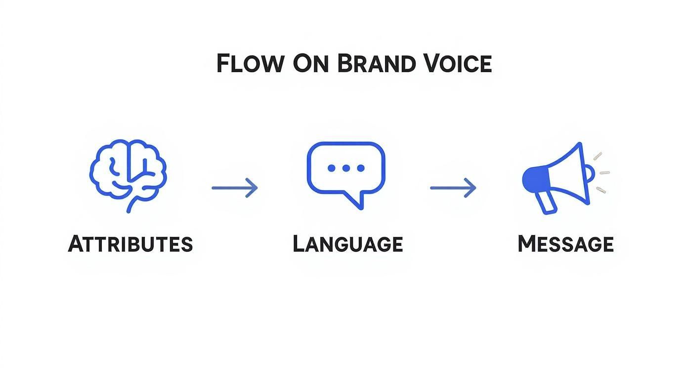
This flowchart shows how you translate high-level brand attributes into specific language choices, which ultimately shapes a powerful and consistent message.
Building a Sales or Presentation Deck
Think about it: your sales deck is often a potential customer's first deep dive into your company. It has to be flawless.
- Typography: Is the deck using the correct font hierarchy for H1, H2, and body text?
- Color Palette: Are the primary and secondary colors being used strategically to highlight key data points and calls-to-action?
- Imagery: Do the photos, icons, or illustrations feel right? Do they match the style defined in the guidelines?
Honestly, the best way to nail this is to provide a master presentation template. It's the most reliable way to ensure every slide deck that leaves the company is a perfect ambassador for your brand.
To help keep your team on track, a simple checklist can work wonders.
Brand Guideline Application Checklist
Use this quick-reference checklist to ensure your brand stays consistent across the most common marketing channels and assets. It’s a great tool for self-audits or team reviews.
| Asset/Channel | Key Elements to Check | Common Pitfalls |
|---|---|---|
| Social Media Posts | Logo use, color palette, typography, tone of voice, image style. | Using old logos; off-brand humor; inconsistent filters. |
| Email Newsletters | Header/footer design, font consistency, button colors, voice. | "Stretching" the logo; using system default fonts. |
| Sales Decks | Template use, data visualization colors, image quality, copy tone. | Going "rogue" with custom slides; mismatched chart colors. |
| Website/Blog | Heading structure, link colors, photo style, CTAs. | Inconsistent button styles; low-quality stock photos. |
| Video Content | Intro/outro graphics, lower-third text, background music, host tone. | Forgetting to add the logo; text that's hard to read. |
This isn't about policing your team; it's about providing guardrails that empower them to create confidently and consistently. By actively training your people, giving them easy access to resources, and showing them practical examples, you'll see your brand guidelines become an invaluable part of your company's DNA.
Your Top Brand Guideline Questions, Answered
Okay, so you've got the big picture down, but now the nitty-gritty questions are starting to surface. This is totally normal. Moving from theory to a practical, usable document is where the real work begins.
Think of this as your go-to FAQ for those moments you get stuck. I've pulled together the most common questions that pop up when teams are deep in the trenches of building their brand guidelines, along with some straightforward, experience-based answers to keep you moving.
How Often Should We Update Our Brand Guidelines?
Let's get one thing straight: your brand guidelines are never truly "finished." The best ones are living documents that breathe and grow with your company. While you won't be doing a massive overhaul every few months, a yearly review is a fantastic habit to get into.
This annual check-in is the perfect time to ask some critical questions:
- Does our brand voice still sound like us? Does it still connect with our audience?
- Do we need new assets? Maybe templates for a new social media channel we've joined?
- Is any of our guidance confusing people or just plain outdated?
Outside of that yearly refresh, you’ll want to revisit the guidelines whenever there's a major business shift. Think new product launches, expanding into a different market, or a change in who you're trying to reach. Smaller updates, like adding a new logo variation or a secondary color, can happen whenever you need them.
What's the Difference Between a Brand Guide and a Style Guide?
This is a classic, and for good reason—the terms get thrown around interchangeably all the time. But there's a subtle yet important difference that helps clarify what you're actually building.
A style guide is the tactical rulebook. It's all about the visual and editorial nitty-gritty: logo usage, color codes, typography hierarchy, and grammar rules. It answers the question, "How should this look and sound?"
A brand guide, on the other hand, is the whole story. It includes everything in the style guide but also wraps it in the strategic "why." This is where you'll find your mission, vision, values, audience personas, and core messaging.
In short, a style guide is the how, while a comprehensive brand guide is both the how and the why. Getting this right means you're building a resource that doesn't just give orders, but also inspires.
How Can We Get Our Team to Actually Use the Guidelines?
This is the million-dollar question. A beautiful guide that sits in a forgotten folder is a complete waste of effort. The trick is to make following the guidelines the easiest possible option for everyone.
First off, make them ridiculously easy to find. No one should ever have to slack, "Hey, where's the new logo again?" Put them in a central, shared place like your company intranet or a dedicated Notion page.
Next, launch them properly. Don't just send a memo. Hold a fun, engaging training session. Walk people through the why behind the decisions to get genuine buy-in. When people understand the reasoning, they're much more likely to care.
Then, you have to create practical, pre-built templates. Give your team on-brand PowerPoint decks, social media graphics, and document headers. You're making it effortless for them to do the right thing.
Finally, think about appointing a "brand champion" or a small committee. Their job isn't to be the "brand police" but to be a helpful resource. They can turn moments of confusion into quick, friendly teaching opportunities. If you're looking for a deeper dive into branding fundamentals, the Branditok Homepage has a wealth of information to explore.
Can a Small Business Create Effective Brand Guidelines?
Not only can you, you absolutely should. You don't need a 100-page corporate manifesto. For a startup or small business, effectiveness is all about clarity, not page count.
You can start with a simple one-pager that covers the absolute must-haves:
- Your Logo: Primary version and basic rules (like don't stretch it!).
- Your Colors: 3-4 core colors with their HEX codes.
- Your Fonts: One for headlines, one for body text.
- Your Voice: A few sentences on your mission and three words that describe your tone (e.g., "Friendly, knowledgeable, direct").
That's it. This simple document can head off a ton of inconsistency down the road. Your guidelines can, and should, grow as your business does. Starting small is infinitely better than starting with nothing.
Ready to bring your brand to life with stunning, on-brand video content? ShortGenius helps you apply your brand kit in a single click, ensuring every video has your correct logo, fonts, and colors. Go from idea to published, on-brand content in minutes at https://shortgenius.com.