What Is a Brand Kit and How Do You Build One That Works
Discover what is a brand kit and learn how to build one step-by-step. Unpack the essential elements that drive brand consistency across all your content.
Ever wonder how some brands just feel consistent, no matter where you see them? The secret weapon behind that seamless experience is a brand kit.
Think of it as the ultimate playbook for your brand's visual identity. It's not just a folder with your logo in it; it’s a comprehensive guide that gathers all your essential design elements—logos, colors, fonts, and more—into one easy-to-access place. This document is the single source of truth that keeps your entire team on the same page, ensuring everything you create looks and feels like you.
Your Brand Identity Blueprint
Imagine trying to bake a cake without a recipe. You might have all the ingredients, but without instructions, you're likely to end up with a mess. A brand kit is that recipe for your brand. It’s the strategic tool that outlines exactly how your brand should show up in the world, visually and tonally.
This blueprint is invaluable for anyone who touches your brand, from your in-house marketing team to freelance video editors. It gives them clear, practical rules on how to use your assets correctly. The result? A customer gets the same cohesive brand experience whether they’re watching your YouTube video, scrolling past your Instagram post, or reading your latest email newsletter.
Building Trust Through Consistency
This isn't just about looking good; it's about building a rock-solid foundation of trust with your audience. When people consistently see your signature colors, typography, and logo, it creates a powerful sense of familiarity. That familiarity quickly turns into reliability and professionalism in their minds.
Before you can assemble the kit itself, you first need a solid strategy. Understanding how to create a brand identity that drives business growth is the crucial first step.
A brand kit is the essential bridge between your brand strategy and its real-world application. It translates abstract ideas like your mission and values into tangible elements people can actually see and connect with.
Ultimately, a great brand kit empowers your team to create content faster and with more confidence. It cuts out the guesswork, prevents embarrassing design mistakes, and protects the hard-earned equity you've built in your brand. By setting these ground rules, you're paving the way for professional, scalable, and unforgettable storytelling.
The Essential Elements of a Powerful Brand Kit
Think of a brand kit not as a simple folder with your logo, but as the DNA of your brand. It’s the complete rulebook that ensures everything you create—from a quick social media post to a high-production video ad—looks and feels like you. And that consistency pays off. A staggering 71% of consumers are more likely to buy from a brand they recognize on sight.
This is why tools that apply your brand kit automatically, like we do here at ShortGenius, are such a big deal. Take Coca-Cola. Their guidelines don't just say "use red." They specify the exact formula—CMYK: 0, 100, 100, 4—to get that iconic, unmistakable red that you could spot from a mile away.
To build that kind of instant recognition, your brand kit needs a few core components working together. Each one plays a critical part in building a brand that people remember.
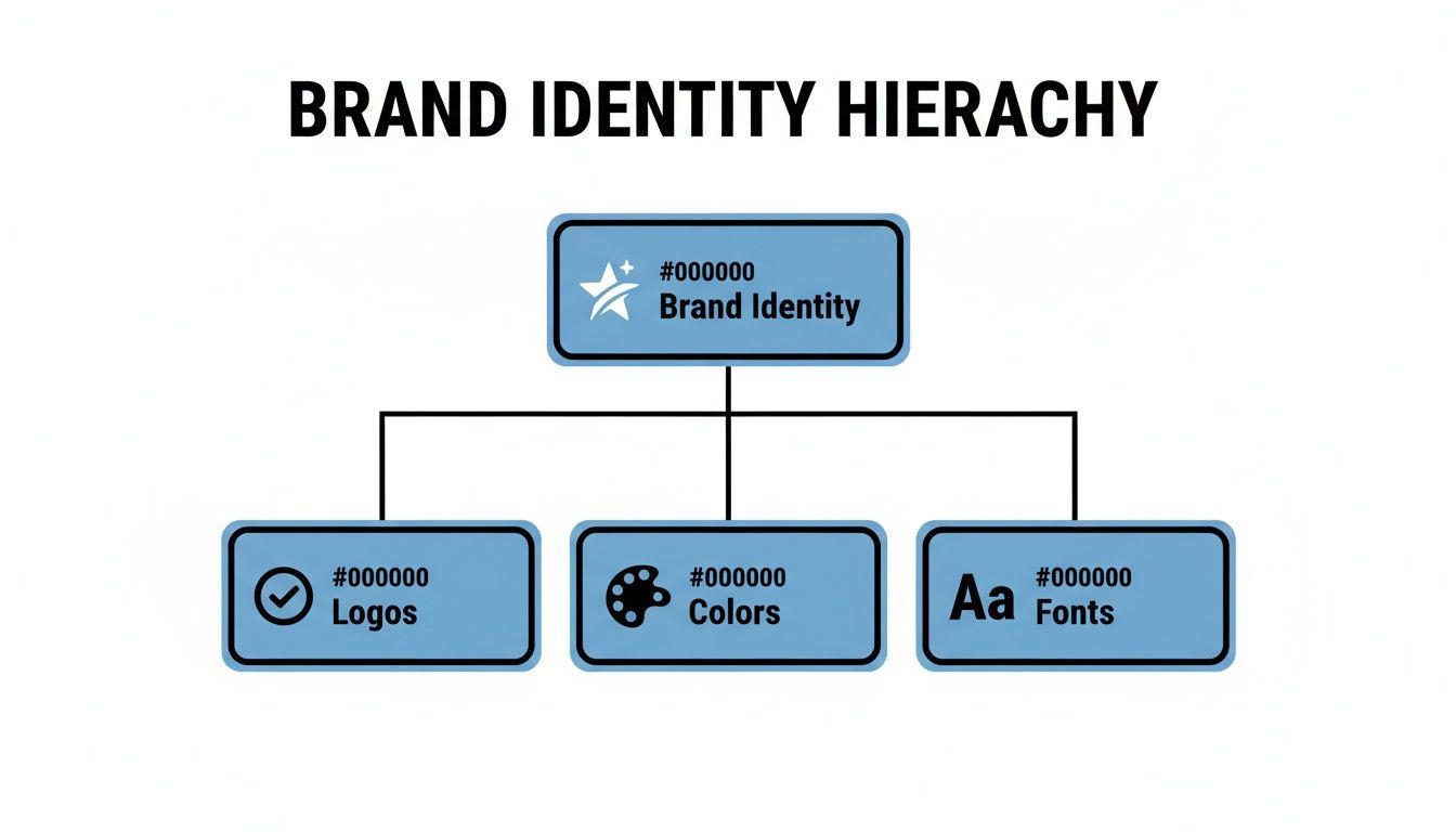
As you can see, foundational elements like your logo, colors, and fonts are the absolute pillars of your brand identity. Get these right, and you're on your way.
Logos: The Face of Your Brand
Your logo is the single most recognizable visual for your business. A proper brand kit doesn't just have one logo file; it provides a whole family of them, ready for any situation you can throw at it.
- Primary Logo: This is the hero. It's the full-detail, go-to version you'll use in most prominent places.
- Secondary Logo: Think of this as a variation for awkward spaces. Maybe it's a stacked version of your horizontal logo, or a slightly simplified one.
- Submark/Icon: This is the most distilled version of your logo, often just an icon or an initial. It’s perfect for small spaces like a website favicon, a social media profile picture, or a subtle watermark on your videos.
Having these variations on hand stops team members from committing the ultimate design sin: stretching or squishing your main logo to make it fit.
Color Palette: The Mood Setter
Color is a shortcut to emotion. It sets the entire mood for your brand before a single word is read. Defining a specific color palette removes all the guesswork and makes sure every piece of content feels like it belongs to the same family.
A solid palette usually includes:
- Primary Colors: These are your 1-3 core colors. They're the foundation of your entire visual identity.
- Secondary Colors: These are your accent colors. Use them for call-to-action buttons, highlights, or to add a little pop.
- Neutral Colors: Your whites, grays, and blacks. They give your primary colors room to breathe and are essential for clean backgrounds and readable text.
For every single color, your brand kit must list the specific codes: HEX for web, RGB for digital screens, and CMYK for anything printed. This isn't optional—it's the only way to guarantee your brand looks the same everywhere.
Typography: The Voice Made Visible
The fonts you choose give your brand a voice. Are you modern and minimalist? Classic and trustworthy? Fun and energetic? Your typography says it all.
A good typography system creates a clear hierarchy, guiding the reader’s eye through your content. At a minimum, you need to define:
- Headings: The font for your main titles (H1, H2, H3). This is often a bolder or more stylized typeface that grabs attention.
- Body Text: A clean, highly legible font for your main paragraphs. Readability is king here.
- Accent Font: A special font for things like buttons or pull quotes that need to stand out from the rest.
Imagery and Iconography
The photos, illustrations, and icons you use tell a story about your brand's personality. Your brand kit should give clear direction on the vibe of your visuals—and just as importantly, what to avoid.
Your guidelines should cover:
- Photography: Should your photos be bright and airy, or dark and moody? Do you use candid shots of real people, or polished studio portraits? Define the editing style and subject matter. You can learn more about creating consistent visuals with our guide on using a text-to-image AI generator.
- Illustrations: Nail down a specific style. Are they flat and graphic, hand-drawn and organic, or something else entirely?
- Iconography: Provide a ready-to-use set of on-brand icons. They should all share a consistent style, like line weight and level of detail, for a polished look.
Brand Voice and Messaging
Finally, a truly great brand kit goes beyond the visuals to define how your brand sounds. Your brand voice is your personality, expressed through words. Crafting a strong mission or purpose is a great starting point; you can find inspiration in these powerful brand statement examples.
To make it practical, define your brand voice with a few key adjectives (e.g., "Confident, Witty, and Direct"). Then, provide real-world examples of do's and don'ts for writing copy. This helps everyone on your team write in a way that sounds authentic to your brand.
Why Every Creator Needs a Brand Kit
Having a defined brand kit isn't just some fancy extra for big corporations. For creators and businesses of all sizes, it’s a genuine strategic advantage. The payoff goes way beyond looking good—it directly sharpens your workflow, builds audience trust, and makes it possible to grow without chaos.
Think of it as the engine that powers a professional and, more importantly, a recognizable presence.
These benefits really boil down to three game-changing areas: consistency, efficiency, and collaboration. Each one helps you move faster and build a much stronger connection with your followers.
Drive Unwavering Consistency
The most obvious win from having a brand kit is unwavering consistency. When every video thumbnail, social post, and newsletter uses the same colors, fonts, and logo placement, you start building a powerful sense of familiarity. This visual repetition isn't just about looking buttoned-up; it subconsciously builds trust.
A brand kit turns your brand from a series of random posts into a cohesive and memorable story. It’s the difference between being a fleeting piece of content and becoming a recognized authority in your niche.
This consistency has a real impact on your bottom line. With video content expected to drive 82% of all internet traffic by 2025, that cohesive look is more important than ever. In fact, 2024 global data shows that brands with strong, consistent visual identities enjoy 23% higher customer loyalty. This is exactly why tools that automate brand kit application are so powerful for video-first creators. You can read more on the power of consistent branding from Brandkit.com.
Achieve Radical Efficiency
A brand kit is a massive time-saver. Just think about all the minutes you waste hunting for the right logo file, guessing a color's hex code, or trying to remember which font you used for last week's video captions. A brand kit completely eliminates that daily scramble by putting all your assets and rules in one place.
This means you and your team can create content faster and with way more confidence. Instead of getting bogged down in tiny design decisions, you can focus on what actually matters: creating killer content that resonates with your audience. For a real-world example, see how ShortGenius uses AI for UGC ads by instantly applying brand kits to scale video production.
Enable Seamless Collaboration
As your brand grows, you'll inevitably start working with other people—freelancers, virtual assistants, or new team members. A brand kit is the ultimate tool for making that collaboration seamless. It gives anyone, anywhere, the power to create on-brand content without needing constant hand-holding.
- Reduce Revisions: When the rules are clear, you minimize all that painful back-and-forth on design edits.
- Empower Partners: Freelancers and agencies can hit the ground running, producing high-quality, on-brand work from day one.
- Scale with Confidence: You can grow your team without worrying that your brand's quality and consistency will fall apart.
At the end of the day, a brand kit ensures that as your output increases, your brand identity stays strong, cohesive, and instantly recognizable to the people who matter most.
How to Build Your Brand Kit in 5 Simple Steps
Building a brand kit from scratch can feel like a massive undertaking, but it doesn't have to be. When you break it down into a handful of manageable steps, the process becomes much clearer. Think of it like assembling a toolkit, adding one essential piece at a time until you have everything you need.
This 5-step approach will walk you through turning those abstract ideas swirling in your head into a concrete, ready-to-use brand kit that makes creating content a breeze.
Step 1: Define Your Brand Foundation
Before you even think about a font or a color, you need to get to the heart of your brand. This foundation is your "why"—it’s the core purpose that will steer every single design choice you make from here on out.
To get there, start by answering a few crucial questions:
- Mission: What are you ultimately trying to achieve?
- Values: What principles are non-negotiable for you?
- Personality: If your brand walked into a room, what three words would describe it? (e.g., Energetic, Playful, Bold).
- Audience: Who, specifically, are you talking to?
This isn’t just fluff. Your answers become the litmus test for every visual element, ensuring your brand’s look is authentic and not just a passing trend.
Step 2: Select Your Core Visuals
With a solid foundation in place, it’s time for the fun part: choosing the visual pillars of your brand. These are the logo, colors, and fonts that people will immediately associate with you.
- Logo Suite: Get your primary logo finalized, along with a secondary version and a smaller icon or submark for things like social media profile pictures. Make sure you have high-resolution PNG files (with a transparent background) and vector files (like SVG or AI) on hand.
- Color Palette: Let your brand personality guide you. Use a color palette generator to find combos that feel right. Nail down 1-2 primary colors, 2-3 secondary or accent colors, and your go-to neutrals (like black, white, or grey). Don't forget to grab the HEX, RGB, and CMYK codes for each.
- Typography System: Pick a font pairing that captures your brand's voice. A great rule of thumb is to choose one font with some personality for headlines and another clean, easy-to-read font for body copy.
Step 3: Establish Your Imagery Style
Your brand's visual identity goes way beyond just logos and colors. The photos, illustrations, and icons you use are huge in setting the overall mood. This step is all about making sure every image you post feels like it belongs to the same family.
A simple mood board can work wonders here. Are your photos bright and airy or dark and dramatic? Do you prefer realistic photography or custom illustrations? Define the vibe so anyone creating content for you can immediately get on the same page.
Your imagery guidelines should be a compass, not a cage. The goal is to provide clear direction that inspires on-brand creativity, rather than rigid rules that stifle it.
Step 4: Articulate Your Brand Voice
How you sound is just as important as how you look. Your brand voice is your personality brought to life through words. Here, you’ll turn those abstract personality traits into a practical guide anyone on your team can use for writing copy.
- Define Your Tone: List some key adjectives. Are you "Helpful, not condescending"? "Witty, not sarcastic"? Get specific.
- Create Do's and Don'ts: Give real-world examples. For instance, "Do: Use simple, direct language. Don't: Use confusing corporate jargon."
Step 5: Compile and Organize Everything
You've done the hard work—now it's time to pull it all together in one central, easy-to-find place. A disorganized brand kit is an unused brand kit, so the goal is to make it ridiculously simple for you or your team to grab what they need, right when they need it.
Choose a format that fits how you work:
- A shared cloud folder on a service like Google Drive or Dropbox, with clearly labeled subfolders for logos, fonts, etc.
- A dedicated brand management platform if you need more advanced features and control.
- A simple PDF guide that lays out all the rules and links to the asset files.
This final step is what turns a collection of files and guidelines into a living, breathing tool that will keep your brand consistent and strong.
Applying Your Brand Kit to Video and Social Media
Having a polished brand kit tucked away in a folder is a great start, but the real magic happens when you put it to work. This is never more true than in the fast-scrolling worlds of video and social media, where a consistent look and feel can mean the difference between getting noticed and getting ignored.
Let's bridge the gap between your brand guidelines and the actual content you create every day.

Think of your brand kit as the creative filter for every video clip, Reel, or Story you publish. Each element has a job to do, working together to make sure everything you put out there feels undeniably you.
Turning Guidelines Into Action
Translating your abstract brand rules into concrete creative choices doesn't have to be a chore. The trick is to create a simple mental checklist, mapping each part of your kit to a specific element in your video.
Here’s a practical look at how each piece comes to life:
- Logos: That clean logo icon you have? It becomes the perfect, non-intrusive watermark in the corner of your videos, quietly reinforcing who created the content.
- Color Palette: Your primary and secondary colors are your best friends for text overlays, title cards, progress bars, and background graphics. They make your content instantly pop in a crowded feed.
- Typography: The fonts you chose for headlines and body text should be used for all on-screen captions and titles. This creates a cohesive, professional viewing experience.
- Imagery Style: Your photo and video guidelines set the mood. This helps you quickly choose stock footage, b-roll, or graphics that feel right, avoiding a clunky, mismatched look.
When you nail this consistency, you're training your audience. They start to recognize your content at a glance, building the kind of subconscious familiarity that turns casual viewers into loyal fans.
"Knowing that all our content is aligned with our brand guidelines—whether it's the logo, fonts, colors, or even the music—gives us total confidence... It saves time and helps every team member... to produce professional, on-brand videos." - Paul Burke, Head of Global Brand at Amadeus
Applying Your Brand Kit to Video Content
Making sure every video adheres to your brand kit can be done manually or with the help of smart automation. Here’s a breakdown of how each element translates to video production, both the old way and the new way.
| Brand Kit Element | Manual Application in Video | How ShortGenius Automates It |
|---|---|---|
| Logo | Manually placing a PNG file as a watermark in your video editor. | Automatically applies your logo as a persistent watermark in the designated corner of every video. |
| Color Palette | Typing in specific hex codes for every text overlay, shape, or background element. | Instantly applies your primary and secondary colors to all on-screen text, captions, and templates. |
| Typography | Searching for and selecting the correct font file for headlines and body text each time. | Automatically sets your brand fonts as the default for all generated text and titles, ensuring consistency. |
| Brand Voice | Rewriting scripts and captions to match the established tone and personality. | Generates scripts and copy that are already aligned with your brand's unique voice and style. |
As you can see, automation doesn't just speed things up—it removes the chance for human error, guaranteeing every single video is perfectly on-brand.
Automating Consistency in Your Workflow
Let's be real: manually checking hex codes, font names, and logo placement for every single video is tedious. It’s also where mistakes happen. This is where modern tools are a complete game-changer for busy creators and marketing teams.
Imagine uploading your brand kit just once. From that moment on, AI can instantly apply your signature colors, fonts, and logo to any video it generates. A repetitive, mind-numbing task becomes a seamless, automated step in your workflow. Instead of fussing with the details, you get to focus on the fun part: the creative.
This kind of automation ensures that every asset you publish is perfectly aligned with your brand, every single time. It allows you to produce more content at scale without ever sacrificing quality or consistency. For creators looking to make their lives easier, checking out an AI ad generator with built-in brand kit features is a smart move.
Common Mistakes to Avoid With Your Brand Kit
So you’ve built a brand kit. That’s a massive step towards carving out a recognizable identity. But here's the thing: its real power isn’t in its creation, but in its daily use. Even the most stunning brand kit can end up collecting digital dust if it's impractical, hidden away, or a pain for your team to use.
A few common missteps can quickly turn that powerful blueprint into just another forgotten file. The whole point is to create a tool that empowers your team, not one that restricts them. Let's walk through the most common pitfalls I've seen and, more importantly, how to sidestep them so your brand kit becomes a go-to asset for everyone.
Making Guidelines Too Rigid
One of the fastest ways to get your brand kit ignored? Making the rules so strict they feel like a creative straitjacket. When guidelines are too rigid, they suffocate the creativity needed to adapt to new platforms or fresh ideas. A brand kit should be a compass, not a cage.
Instead of locking everything down with inflexible rules, think in terms of a flexible system. Offer a few pre-approved logo variations for different backgrounds or provide templates for social media graphics that have some wiggle room. This gives your team creative freedom within the brand's structure, which encourages them to actually use the kit instead of finding ways around it.
Forgetting to Include Brand Voice
This one is huge. So many people think a brand kit is just a visual playbook. They'll spend weeks agonizing over the perfect shade of blue or the right font pairing but completely neglect to define how the brand should sound. It's a critical oversight. Without a clear voice, your messaging will be all over the place, leaving your audience confused.
Your kit absolutely needs to include:
- Key Personality Traits: Nail down 3-5 adjectives that capture your brand's personality. Are you "Confident, Witty, and Direct"? Or maybe "Warm, Encouraging, and Playful"?
- Practical Examples: Show, don't just tell. Include simple "do this, not that" examples for social media captions, email subject lines, or even video script intros.
This way, your brand's personality comes through loud and clear, no matter who's doing the writing.
A brand kit without a defined voice is only telling half the story. Your visuals grab attention, but your voice is what builds the relationship.
Failing to Ensure Team Adoption
This might be the biggest mistake of them all. You create a beautiful, detailed brand kit, send out a company-wide email... and then it's never spoken of again. If your kit is buried in a maze of Google Drive folders or is too complicated to understand at a glance, people simply won't use it.
To make sure it sticks, weave the brand kit into the fabric of your operations. Make it a core part of onboarding for every new hire and freelancer. Better yet, lean on tools that do the heavy lifting. A platform like ShortGenius lets you upload your brand kit once, and then it automatically applies your logos, colors, and fonts to new video content.
This completely removes the friction. Suddenly, staying on-brand is the easiest option. By embedding your kit directly into daily workflows, you turn it from a static PDF into a living, breathing tool that drives consistency and success.
Got Questions? We've Got Answers
Building a brand kit is a fantastic step, but it's natural for a few questions to pop up along the way. Think of this as the part where we clear up the common head-scratchers, turning your brand guidelines from a simple file into a powerful tool you'll actually use.
How Often Should I Update My Brand Kit?
Your brand kit isn't a "set it and forget it" kind of thing. It's more like a living, breathing part of your business. A good rule of thumb is to give it a thorough review at least once a year to make sure it still feels fresh and aligned with where you're headed.
Of course, if you're making a big move—like a logo redesign, a shift in your core message, or targeting a completely new audience—that's your cue for a major update. The whole point is to keep it relevant and genuinely useful for your team.
What’s the Difference Between a Brand Kit and a Style Guide?
This one trips a lot of people up because the terms get tossed around interchangeably. But there’s a simple way to think about it. The brand kit is the what, and the style guide is the how.
- Brand Kit: This is your toolbox. It’s the actual collection of assets—your logo files, color codes, and font downloads.
- Style Guide: This is your instruction manual. It’s the document that explains how to use those assets, detailing things like logo spacing, when to use which font, and how to capture the brand's voice.
Honestly, the best setups have both. You get the tools and the playbook, making it easy for anyone to represent your brand perfectly without any guesswork.
Can I Create a Brand Kit If I’m Just Starting Out?
Yes! In fact, you absolutely should. Creating a simple brand kit is one of the smartest moves you can make as a new business or creator. It establishes a professional look right from the start, which is huge for building trust and getting people to remember you.
You don't need a sprawling, 50-page document either. Just start with the basics:
- A primary logo
- A simple color palette (think 3-5 core colors)
- One or two key fonts
That’s it. This small foundation is more than enough to keep your early content looking sharp and consistent, helping you build a brand that people recognize from day one.
Ready to stop guessing and start creating consistently branded video content in minutes? ShortGenius allows you to upload your brand kit once, then our AI automatically applies your logos, fonts, and colors to every video. Try it today at https://shortgenius.com.