ویڈیو اور سوشل میڈیا کے لیے امیج کی کلر کارکشن کیسے کریں
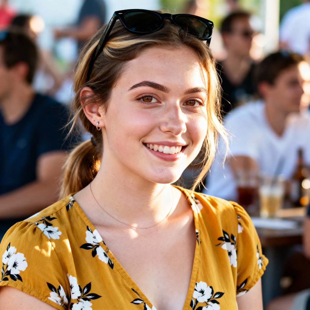
تھمب نیلز، اشتہارات اور شارٹ فارم ویڈیو کے لیے امیج اثاثوں کی کلر کارکشن سیکھیں۔ وائٹ بیلنس، ایکسپوژر، سکن ٹونز اور کراس ڈیوائس مستقل مزاجی کو ماسٹر کریں۔
آپ نے iPhone، mirrorless کیمرہ، اور webcam پر ایک short-form campaign شوٹ کی ہے۔ پروڈکٹ وہی ہے، برانڈ کلرز وہی ہیں، لیکن ہر ڈیوائس سے thumbnail مختلف کہانی سناتی ہے۔ ایک نیلا لگتا ہے، دوسرا نارنجی ہو جاتا ہے، اور webcam فریم skin tones کو سبز کی طرف دھکیل دیتا ہے۔ جب آپ saturation کو ایڈجسٹ کرنا شروع کرتے ہیں، تو آپ images درست نہیں کر رہے ہوتے۔ آپ inconsistencies کا پیچھا کر رہے ہوتے ہیں۔
ایک امیج کو color correct کرنے کے لیے thumbnails اور ad creatives کے لیے، اس عمل کو ایک controlled pipeline کی طرح سمجھیں۔ پہلے ایک believable neutral image قائم کریں، پھر usable detail واپس حاصل کریں، پھر لوگوں اور برانڈ کلرز کو refine کریں، اور صرف اس کے بعد creative grade شامل کریں۔ یہ ترتیب اہم ہے کیونکہ ایک stylish look white balance کی غلطی، clipped highlights، یا ایک کیمرہ اینگل سے دوسرے تک رنگ بدلنے والے چہرے کو ٹھیک نہیں کر سکتی۔
کسی بھی Slider کو چھونے سے پہلے Color Issues کا Diagnosis کریں
زیادہ تر سست correction سیشنز غلط پہلے قدم سے شروع ہوتے ہیں۔ ایڈیٹر temperature control کھولتا ہے، اسے drag کرتا ہے جب تک امیج خوشگوار نہ لگے، پھر contrast اور saturation سے نتائج کی مرمت کرنے کی کوشش کرتا ہے۔ یہ طریقہ ایک photograph کے لیے کام کر سکتا ہے، لیکن thumbnails اور ad variations کے batch میں یہ ٹوٹ جاتا ہے۔
تین سوالات سے شروع کریں:
- Dominant cast کیا ہے؟ کیا پورا فریم warm، cool، green، یا magenta ہے؟ پہلے neutral objects دیکھیں، vivid packaging یا colored clothing نہیں۔
- Exposure کہاں فیل ہو رہی ہے؟ کیا bright areas texture کھو رہے ہیں، یا shadows facial اور product detail چھپا رہے ہیں؟
- Contrast flat ہے یا crushed؟ Flat image میں tones کے درمیان separation کی کمی ہوتی ہے۔ Crushed image میں shadows یا highlights غیر قدرتی طور پر blocked لگتے ہیں۔
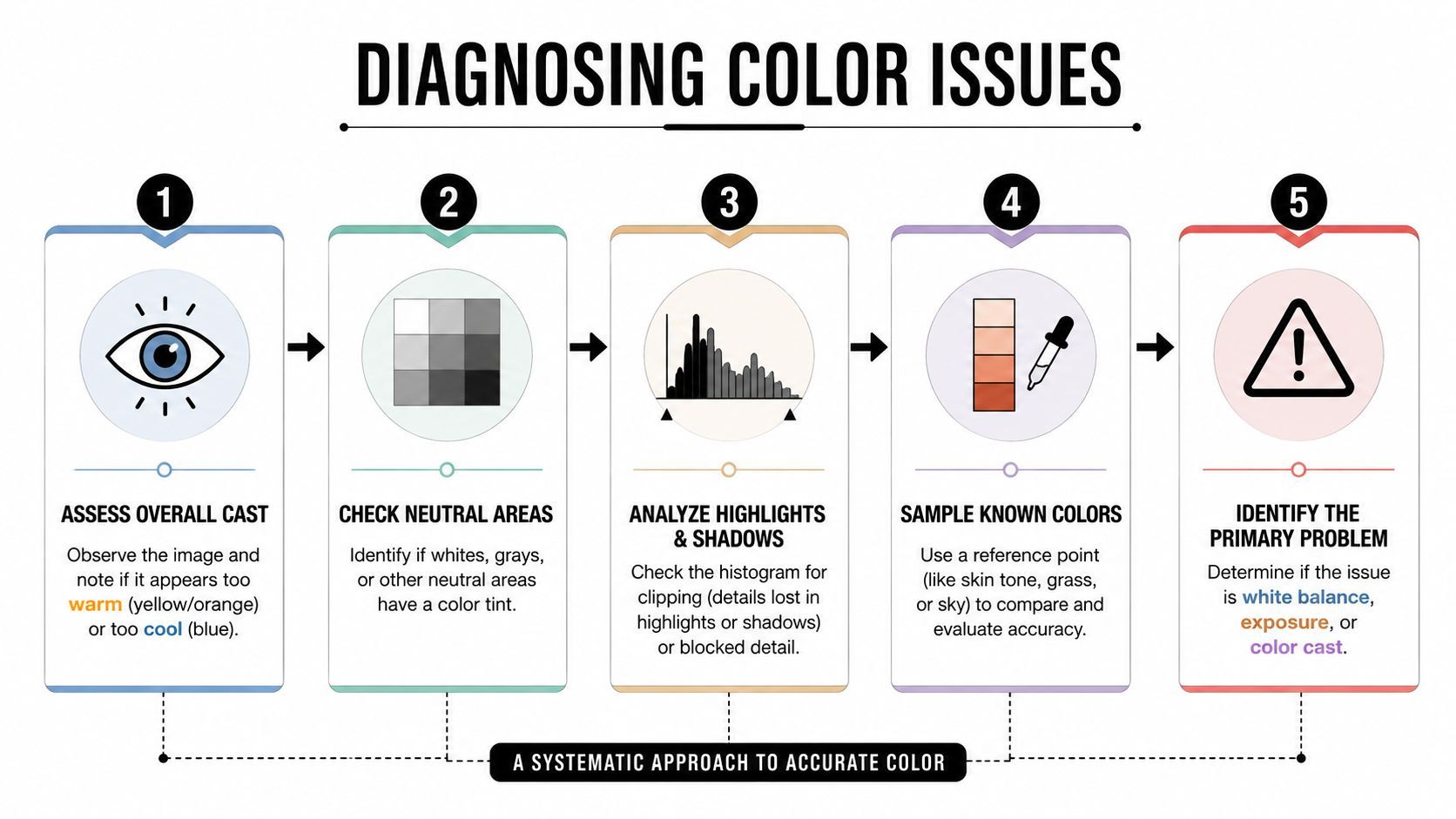
پہلے neutral areas پڑھیں
Tungsten-lit product shot میں اکثر واضح orange cast ہوتا ہے۔ Overcast outdoor فریم نیلا لگ سکتا ہے، لیکن green-magenta shift midtones میں چھپی ہو سکتی ہے۔ Mixed-light interview مشکل تر ہے کیونکہ کھڑکی سے daylight چہرے کے ایک طرف cool کر سکتی ہے جبکہ practical lamp دوسری طرف warm کرتی ہے۔
Histogram استعمال کریں tonal distribution سمجھنے کے لیے، لیکن یہ ہر color problem کی نشاندہی نہ کریں۔ Histogram بتا سکتا ہے کہ امیج shadows یا highlights کی طرف heavily weighted ہے۔ یہ یہ نہیں بتا سکتا کہ white shirt neutral ہے، اس لیے امیج inspect کریں اور vectorscope استعمال کریں جب آپ کا software یہ فراہم کرے۔
ایک مفید reference polished AI portrait color guide ہے، خاص طور پر جب آپ subtle portrait changes کا موازنہ کر رہے ہوں اور believable correction کو artificial makeover سے الگ کرنا چاہیں۔
Primary problem کا نام دیں
ایڈیٹنگ سے پہلے ایک dominant issue منتخب کریں۔ اگر امیج underexposed اور green ہے، تو exposure problem کو cast کا فیصلہ کرنے کے لیے کافی ٹھیک کریں، لیکن ہر flaw کو ایک ساتھ compensate نہ کریں۔ Primary failure کو label کرنا آپ کو saturation استعمال کرنے سے روکتا ہے poor contrast چھپانے کے لیے یا tint استعمال کرنے سے incorrect light source کی تلافی کے لیے۔
Practical rule: اگر آپ problem کو ایک جملے میں بیان نہ کر سکیں، تو آپ نے اس کا diagnosis ابھی نہیں کیا۔
Camera matching کے لیے، ہر source سے ایک still save کریں اور انہیں side by side ایک جیسے display conditions میں compare کریں۔ Cross-camera color consistency ایک active technical problem ہے۔ Adaptive white-balance correction پر research نے پایا کہ illumination-dependent transformations spatially complex یا camera-specific lighting میں fixed correction سے محفوظ ہو سکتے ہیں، جیسا کہ اس peer-reviewed study of non-diagonal white-balance models میں بیان ہے۔
White Balance اور Exposure کو Foundation کی طرح ٹھیک کریں
White balance اور exposure usable image کی technical base بناتے ہیں۔ اگر neutral point غلط ہے، تو skin tones، product colors، اور brand accents سب error inherit کر لیتے ہیں۔ اگر exposure غلط ہے، تو بعد کی curve adjustments اکثر polished-looking image بناتی ہیں جن میں information غائب ہوتی ہے۔
White-balance eyedropper کو neutral ہونے والی surface پر رکھیں، جیسے gray card، white wall، یا unprinted gray area۔ Specular highlights، colored reflections، اور lighting کے adaptation کی وجہ سے white لگنے والی objects سے بچیں۔ Eyedropper شروعات ہے، فیصلہ نہیں۔
Temperature اور tint الگ فیصلے چاہیے
Temperature warm سے cool direction کو address کرتی ہے۔ Tint green سے magenta direction کو handle کرتی ہے۔ یہ interact کرتے ہیں کیونکہ ایک کو تبدیل کرنے سے دوسرا cast زیادہ visible ہو سکتا ہے، خاص طور پر fluorescent interiors، LED lighting، اور colored walls والی scenes میں۔
چھوٹی temperature adjustment کریں، رک جائیں، پھر tint reassess کریں۔ دونوں controls کو aggressively drag نہ کریں۔ iPhone image correct کرتے ہوئے یاد رکھیں کہ computational processing نے پہلے ہی pleasing white balance اور contrast profile منتخب کر لیا ہوگا۔ Mirrorless RAW file زیادہ neutral latitude دیتی ہے، جبکہ webcam frame میں baked-in processing recovery کو محدود کر سکتی ہے۔
Histogram کو check کی طرح استعمال کریں
جب امیج neutral لگے، histogram اور brightest important areas چیک کریں۔ آپ subject preserve کرنے والی tonal distribution تلاش کر رہے ہیں، perfectly centered graph نہیں۔ White product high end پر clipped ہوئے بغیر occupy کر سکتی ہے، جبکہ dark background low رہ سکتا ہے بغیر whole image کو underexposed بنائے۔
Product-focused campaigns کے لیے، accurate color setting اور surrounding visual context پر منحصر ہے۔ Lifestyle photography for better conversions پر guidance آپ کو object سے آگے سوچنے میں مدد دے سکتی ہے، خاص طور پر جب environment packaging یا clothing پر color reflect کرے۔
Foundation stable ہونے پر، corrected frame کو neighboring shots سے compare کریں۔ Technically neutral image sequence کے لیے غلط ہو سکتی ہے اگر surrounding images warmer، darker، یا much contrasty ہوں۔ Set match کریں، صرف individual file نہیں۔
Highlights اور Shadows کو Recover کریں بغیر Detail کھوئے
Thumbnail work tonal mistakes کو جلدی expose کرتی ہے۔ Blown product label blank shape بن جاتا ہے۔ Shadow میں buried face compression اور reduction پر expression کھو دیتا ہے۔ Correction کا چیلنج ہر region کو bright بنانا نہیں ہے۔ Small display sizes پر meaning carry کرنے والی detail preserve کرنا ہے۔
اپنے editor میں clipping indicators سے شروع کریں۔ Bright areas میں recoverable texture ہو تو highlights کو whites control سے پہلے lower کریں۔ Highlights broader tonal region پر کام کرتے ہیں، whites brightest tones کا endpoint define کرتے ہیں۔ Whites کو بعد میں استعمال کریں clean upper boundary قائم کرنے کے لیے بغیر whole image flatten کیے۔
Broad recovery سے endpoint control تک کام کریں
ایک practical order یہ ہے:
- Highlights: Bright regions کو pull back کریں جو subject سے distract کریں یا product texture چھپائیں۔
- Whites: Highlight detail visible ہونے پر brightest tonal point set کریں۔
- Shadows: Eyes، hair، اور product edges کے ارد گرد dark regions کو carefully open کریں۔
- Blacks: Shadow information کی مقدار طے کرنے کے بعد depth قائم کریں۔
ترتیب اہم ہے کیونکہ highlights recover کرنے سے پہلے blacks lift کرنے سے امیج gray اور weak لگ سکتی ہے۔ Shadows کو جلدی open کرنے سے contrast بعد میں add کرنے کا لالچ ہو سکتا ہے، جو detail loss کو recreate کر دے۔
Delivery size پر judge کریں
Noise، banding، اور texture problems identify کرنے کے لیے full resolution پر inspect کریں، لیکن final decision delivery size پر judge کریں۔ 100% پر attractive لگنے والی shadow lift social compression کے بعد muddy chroma noise بن سکتی ہے۔ یہ smartphone footage اور webcam captures میں عام ہے جہاں dark regions میں aggressive noise reduction یا sharpening ہو سکتا ہے۔
کچھ information recoverable نہیں ہوتی۔ اگر source نے bright forehead، white label، یا reflective bottle clip کیا، تو whites reduce کرنے سے missing texture واپس نہیں آئے گی۔ Shot replace کریں، area mask کریں، یا crop redesign کریں slider force کرنے کی بجائے۔
Useful question یہ نہیں “میں کتنی detail recover کر سکتا ہوں؟” بلکہ “کون سی detail reduction اور compression کے بعد پڑھی جا سکتی ہے؟”
Batch correction کے لیے، set بھر ایک جیسا visual reference استعمال کریں۔ ایک camera پر convincing لگنے والا method دوسرے پر different noise اور contrast behavior create کر سکتا ہے۔ Nonlinear color mapping کے benchmarks نے corrected color error اور execution time دونوں evaluate کیے ہیں، جو production teams کے لیے practical point reinforce کرتے ہیں: quality اور throughput کو الگ نہیں بلکہ together consider کرنا چاہیے۔ York University color-balance benchmark 65,000 سے زیادہ paired images پر training بیان کرتا ہے اور training میں استعمال نہ ہونے والے camera models پر generalization رپورٹ کرتا ہے۔
Human Content کے لیے Skin Tones اور Color Tint کی Correction
دیکھنے والے skin-tone error کا نام نہ لیں، لیکن اس کا اثر نوٹس کرتے ہیں۔ Orange ہونے والا چہرہ overheated لگ سکتا ہے۔ Green cast کسی کو ill بنا سکتا ہے۔ Magenta shift makeup اور clothing کو frame کے باقی حصے سے disconnected بنا سکتا ہے۔
Vectorscope available ہو تو اس سے شروع کریں۔ Skin-tone isolation mask یا HSL selection استعمال کریں face inspect کرنے کے لیے بغیر vivid background کے distraction کے۔ Vectorscope hue direction کا repeatable reference دیتا ہے، جبکہ آپ کی آنکھیں چیک کرتی ہیں کہ correction scene کی lighting اور complexion سے fit ہے۔
Saturation سے پہلے hue correct کریں
HSL controls استعمال کریں orange اور red ranges target کرنے کے لیے، پھر unwanted cast ہٹانے والی سب سے چھوٹی hue adjustment کریں۔ Fluorescent lighting green influence پیدا کرتی ہے، جبکہ warm practicals faces کو orange کی طرف دھکیلتی ہیں۔ Painted walls، colored signs، یا product packaging سے environmental spill صرف face کے ایک طرف affect کر سکتا ہے، اس لیے global correction unaffected skin کو خراب کر سکتی ہے۔
Saturation کو restraint ملنی چاہیے۔ اسے بڑھانے سے face momentarily lively لگ سکتا ہے، لیکن یہ redness، makeup، اور compression artifacts exaggerate کر دیتا ہے۔ Modest reduction believable skin restore کر سکتی ہے، خاص طور پر camera کے strong processing کے بعد۔
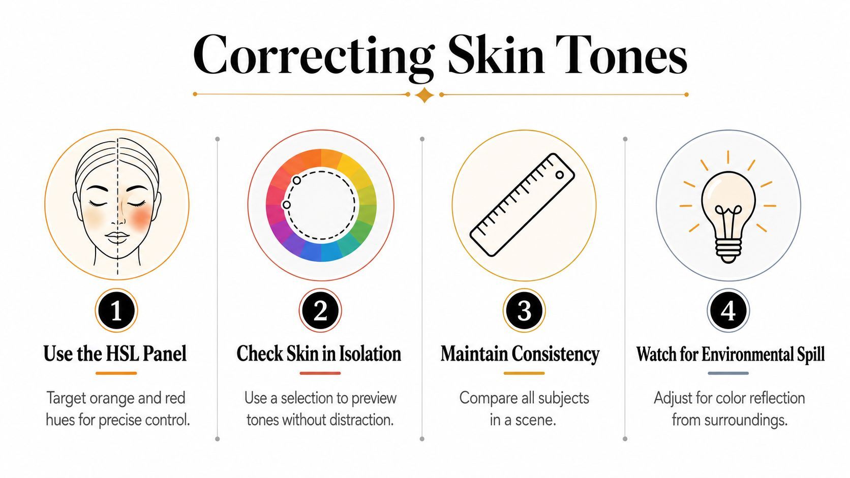
Subject کو scene کے مقابلے میں چیک کریں
Technically acceptable skin blue background یا saturated brand color کے مقابلے میں غلط لگ سکتی ہے۔ ایک ہی scene میں تمام subjects compare کریں، پھر full composition میں face review کریں۔ ہر شخص کو identical appearance کی طرف force نہ کریں۔ Camera یا lighting cast ہٹاتے ہوئے natural variation preserve کریں۔
Thumbnail کے لیے، face، eyes، اور شخص کے ہاتھ میں object کو prioritize کریں۔ یہ glance پر message carry کرتے ہیں۔ اگر background subject سے compete کر رہا ہے، تو اس کی saturation یا luminance selectively reduce کریں skin overcorrect کرنے کی بجائے۔
نیچے ویڈیو portrait color decisions کے لیے visual reference دیتی ہے اور دکھاتی ہے کہ چھوٹی tonal changes perceived realism کو کیسے affect کرتی ہیں۔
Correction on/off toggle کر کے ختم کریں۔ اگر change واضح ہے لیکن دیکھنے والا یہ نہ بتا سکے کہ کیا بدلا، تو آپ قریب ہیں۔ اگر face unusually vivid لگنے کی وجہ سے پہلی چیز بن جائے، تو adjustment reduce کریں۔
Brand Consistency کے لیے Selective Color Adjustments اور Curves لگائیں
Neutral correction امیج کو صحیح neighborhood میں لے آتی ہے۔ Brand consistency کے لیے deliberate control چاہیے۔ Cameras کے بیچ orange کی طرف shift ہونے والا red package campaign کو کمزور کر سکتا ہے حتیٰ کہ overall exposure اور white balance acceptable ہوں۔
Commercially اہم colors کے لیے selective controls استعمال کریں۔ Product hue، brand accent، یا background color isolate کریں، پھر hue، saturation، اور luminance independently adjust کریں۔ یہ global saturation بڑھانے سے محفوظ ہے جو skin، reflections، اور unwanted background colors کو بھی intensify کرتا ہے۔
Whole image نہیں، important color target کریں
Product color کو subtle hue shift چاہیے ہوگا جبکہ luminance stable رہے۔ تینوں HSL properties ایک ساتھ بدلیں تو object brand reference سے brighter، darker، یا artificial بن سکتا ہے۔ Corrected asset کو trusted packaging image، approved thumbnail، یا brand palette سے color-managed environment میں compare کریں۔
Masks correction کو precise بناتے ہیں۔ Luminance mask glossy packaging پر highlights protect کر سکتی ہے جبکہ color mask product body isolate کرتی ہے۔ Edge پر halo نہ بنے اس لیے selection feather کریں، خاص طور پر hair، glass، اور reflective surfaces کے ارد گرد۔
Controlled separation کے لیے curves استعمال کریں
Gentle curve depth create کر سکتی ہے بغیر ہر thumbnail کو high-contrast poster بنائے۔ Subject کے midtones کے ارد گرد separation add کریں، important facial detail intact رکھیں، اور dark areas میں blocked texture چیک کریں۔ Heavy-handed S-curves compression artifacts کو visible بناتے ہیں اور portrait کو natural feel دینے والی soft transitions ہٹا دیتے ہیں۔
Correction grading بن جاتی ہے۔ Correction امیج کے coherent اور believable ہونے کا جواب دیتی ہے۔ Grading امیج کے brand جیسا feel ہونے کا۔
Brand consistency repeatable decisions سے آتی ہے، identical slider values سے نہیں۔
Presets صرف ان adjustments کے لیے save کریں جو source material بھر stable رہیں۔ Camera-matching preset controlled setup میں اچھا transfer ہو سکتا ہے، لیکن lighting، lens، یا background change پر fail کر سکتا ہے۔ Reusable base look بنائیں، پھر selective corrections کو ہر shot کے لیے adjustable رکھیں۔
Cross-camera work adaptive methods سے فائدہ اٹھاتا ہے بجائے اس presumption کے کہ ہر sensor alike respond کرتا ہے۔ Calibrated color correction matrices پر recent research sensors کے بیچ consistency address کرتا ہے، جو ecommerce libraries، UGC، اور mixed devices استعمال کرنے والے agency pipelines کے لیے relevant ہے۔ ICCV 2025 cross-camera color constancy paper بتاتا ہے کہ ایک universal look cameras کے بیچ کیوں fail کر سکتا ہے۔
اپنے Workflow کے لیے صحیح Tool منتخب کریں
صحیح editor prestige سے کم، pipeline میں correction کہاں ہوتی ہے اس پر منحصر ہے۔ Lightroom still thumbnails اور batch presets کے لیے efficient ہے۔ Photoshop masks، compositing، cleanup، یا precise product-color work کے لیے strong ہے۔ Capture One RAW handling اور camera profiles چاہیے ہونے والے photographers کے لیے valuable ہے، جبکہ mobile editors phone پر شروع و ختم ہونے والی پوری campaign کے لیے useful ہیں۔
| Tool | Batch Speed | Cross-Camera Consistency | Mobile Sync | Best For |
|---|---|---|---|---|
| Lightroom | Still batches اور presets کے لیے High | Profiles اور reference images controlled ہوں تو Strong | Adobe workflows میں Strong | Repeated thumbnail sets manage کرنے والے Creators |
| Photoshop | Large batches کے لیے Slower | Detailed manual matching کے لیے Strong | Lightroom کے مقابلے Limited | Product retouching، masks، اور layered composites |
| Capture One | Organized RAW workflows کے لیے Strong | Camera-specific profiles available ہوں تو Strong | Surrounding workflow پر منحصر | Photography-led teams اور tethered capture |
| Mobile editors | Quick individual edits کے لیے Fast | Devices اور app processing کے بیچ Variable | Mobile پر Native | On-location corrections اور rapid publishing |
Tool کو bottleneck سے match کریں
ایک solo creator کو batch-oriented editor presets، consistent export setup، اور small reference library سے فائدہ ہوتا ہے۔ کئی brand accounts manage کرنے والی team کو shared profiles، naming conventions، approval steps، اور technical correction اور creative grading کے درمیان واضح فرق چاہیے۔
AI auto-correction وقت بچا سکتی ہے جب source material reasonably consistent ہو اور output کو صرف first pass چاہیے۔ یہ liability بن جاتی ہے جب امیج میں mixed lighting، unusual skin tones، colored reflections، یا faithful hue والی product ہو۔ Algorithm کی confidence قبول کرنے کی بجائے result review کریں۔
Ads اور images بنانے والی teams کے لیے، ShortGenius (AI Video / AI Ad Generator) scriptwriting، image generation، video assembly، voiceovers، editing tools، resizing، اور brand-kit application کو ایک workflow میں combine کرتا ہے۔ اس کے image-editing models prompt-guided transformations support کر سکتے ہیں، لیکن final color approval brand reference کے خلاف اور ایک سے زیادہ devices پر ہونی چاہیے۔
Scalable setup hybrid ہوتا ہے: repeatable base correction automate کریں، پھر skin، product color، mixed light، اور campaign-level consistency کے لیے human attention reserve کریں۔
عام Mistakes سے بچیں اور Maximum Quality کے لیے Export کریں
Correction آپ کے editing application میں perfect لگ سکتی ہے اور upload کے بعد fail ہو سکتی ہے۔ سب سے عام مجرم missing cinematic preset نہیں ہے۔ Editing کے دوران استعمال color space اور web delivery کے assumptions کا mismatch ہے۔
Modern web کا default RGB workflow sRGB کے ذریعے formalized ہوا۔ HP اور Microsoft نے 1996 میں اسے propose کیا، W3C نے 5 November 1996 کو proposal شائع کیا، اور IEC نے IEC 61966-2-1:1999 کے طور پر 18 October 1999 کو formalized کیا۔ W3C sRGB documentation بتاتا ہے کہ یہ baseline monitors، printers، اور web workflows کے بیچ color delivery کو predictable کیوں بناتی ہے۔
Export کو practical رکھیں
Social thumbnails، covers، اور ad creatives کے لیے، sRGB tagged RGB file export کریں جب تک destination explicitly دوسرا workflow نہ مانگے۔ Adobe RGB print applications کے لیے broader range hold کر سکتی ہے، لیکن ordinary web delivery کے لیے safest default نہیں ہے۔ Platform convert یا interpret کرنے کے بعد wider color space بہتر لگے گا اسے assume نہ کریں۔
Sharpening کو reflex کی طرح avoid کریں۔ Excessive sharpening text، hair، اور product edges کے ارد گرد bright halos بناتا ہے۔ Resizing اور compression کے بعد یہ halos زیادہ distracting ہوتے ہیں، خاص طور پر high-contrast thumbnail subjects کے ارد گرد۔
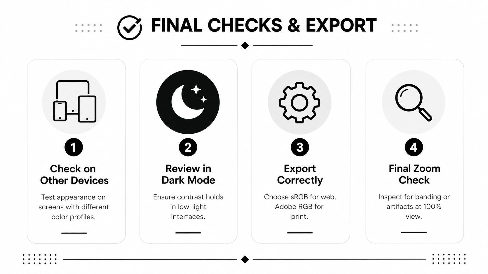
Final review میں شامل ہونا چاہیے:
- Device check: Export کو phone اور desktop display پر کھولیں، پھر source سے compare کریں۔
- Dark-mode check: Dark interface backgrounds کے مقابلے میں image review کریں تاکہ shadows اور outlines readable رہیں۔
- Color-space check: Confirm کریں کہ file web delivery کے لیے sRGB استعمال کرتی ہے اور profile embedded ہے جب application support کرے۔
- Detail check: 100% پر banding، halos، posterization، اور compression artifacts inspect کریں۔
- Sequence check: Asset کو دیگر campaign creatives کے پاس رکھیں camera یا preset drift پکڑنے کے لیے۔
جہاں production volume subjective review کو مہنگا بنائے، وہاں color correction measurable ہونی چاہیے۔ Recent review نوٹ کرتی ہے کہ color image quality assessment ابھی standardized datasets اور evaluation metrics کی کمی ہے، جبکہ newer correction systems accuracy اور fast inference balance کر رہے ہیں۔ 2025 review of color image quality assessment یاد دلاتی ہے کہ automated pipeline کے لیے “looks better” sufficient quality-control standard نہیں ہے۔
آپ کا final checklist publishing سے پہلے تین failures پکڑے: غلط color space، aggressive recovery سے destroyed detail، اور ایک camera match کرنے والی correction جو campaign کے باقی حصے سے match نہ کرے۔
ShortGenius (AI Video / AI Ad Generator) corrected images اور brand references کو short-form videos، ad creatives، thumbnails، captions، اور resized campaign assets میں تبدیل کرنے میں مدد دیتا ہے، editing اور brand-kit tools وہی workflow میں built-in۔ ShortGenius (AI Video / AI Ad Generator) وزٹ کریں consistent multi-channel content create، refine، اور organize کرنے کے لیے بغیر visual finish پر control کھوئے۔